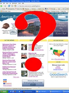
The website redesign holy grail
So, I've asked for it and now I'm getting it: ideas on how we can improve the website.
Today’s email:
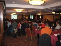
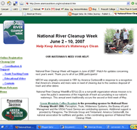
This is a very cool tool and one that would be awesome to replicate on our website. Take the tour. Different things pop up as you move your cursor. Click on them and you'll see more details. www.riverventure.org/columbia/index.htmlWhen I first came to American Rivers I was a little surprised how little pride folks took to their online image, so I made it a priority to create a little excitement over the redesign process—hence the web 2.0 brown bag lunch. And, what better way to do that than open the door to feedback, ideas, suggestions, confessions, etc.
And I’ve gotten some great feedback, but I can’t help but wonder if I’m creating unrealistic expectations. It's obvious I get excited over this stuff (just ask my wife about my wiki rants), but can there be too much of a build up? Basically, is the hint of the ‘redesign process’ creating a Holy Grail syndrome? Yes, sky’s the limits with what we can do, but there has to be some limitations.
The biggest challenge (surprise!) is probably money, then probably Convio, and lastly, ‘eyes bigger than our stomach’ feeling. Meaning, if we want user generated content, many may not realize how much backend work it takes to properly manage it. We don’t want to bite off more than we can chew with what is required to maintain a site full of bells and whistles - just because we build it doesn't mean they will come...the dreaded ‘field of dreams’ complex.
So, getting folks is excited is good, but what happens if we can’t live up to those expectations. Am I really advancing the ball here by rallying the troops? Yes, I want ideas, buy-in, and excitement, but what if our site redesign turns out to be less than what folks are imagining.
I guess that’s one reason I feel the need to air this process out a bit.
