Monday, April 16, 2007

American Rivers dot org is LIVE!

It's been one year since I applied to American Rivers, 10 months of website redesign internal chatter and more than six months of blogging about our redesign(s) and I'm happy to report that we've reached the end of the road...maybe the end of this road (like a launch is ever an end).

I had all of these great ideas about how I could show the good, bad and not so good times along the way, but I'm just too tired at this point.

To quickly recap: We were supposed to launch last Thursday, before everyone awoke the next morning, but Convio had a widespread advocacy module update deployment that same night which brought roughly a quarter of the servers to their knees. That was sleepless night #1. We weren't aware of this and it inevitably cost us a night's worth of work. We've been backpedaling ever since.

However, as another weekend was consumed by updates, review and pages being built out (America's Most Endangered Rivers report comes out in a few hours, so new pages needed to be built), we finally flipped the switch this morning at 5:45.

It's good to finally have all our cards on the table, but it doesn't make the *cleaning* any easier. There's a lot to do before the biggest traffic day of the year (release of Most Endangered Rivers report), but all and all, we're very pleased where we are right now. Take a spin.

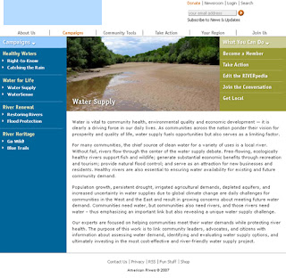
Here are a few before and after pictures -

Homepage


About Us


Campaigns


Join Us

Thursday, April 12, 2007

Blog and first wiki glossary are LIVE!

Though the national redesign is on it's fourth day of delay (not bad!), the wiki glossary and blog are now live. Over 60 posts fill the community blog, dating back to 2006, and more than a handful of terms exist in the first wiki glossary dedicated to river conservation - very cool.

For me, the blog wrangling continues - hence my light blog posts over the last couple of weeks - and wrapping up what we plan is the last day of web development.

There are lots of little details left to complete, but we're planning on launching the redesigned national website tonight. Really.

As somewhat of a teaser, I released the blog and wiki to the organization last Friday and have gotten some good feedback as well as suggestions for moving forward. One in particular was to create a redirect for our blog and wiki so we can drop the added verbage (i.e. /wordpress/ and /wiki/index.php/Main_Page) at the end of the URL.

I assumed that we would keep these URLs as destination sites, only accessible via our website, but it didn't make sense as a co-worker suggested. So we redirected both to simply the subdomain, wiki.americanrivers.org and blog.americanrivers.org.


On a side note, I recently learned what that little box was actually called next to the URL...favicon (favorite + icon). Pretty cool.

Wednesday, April 11, 2007

Act for Healthy Rivers is LIVE!

After 8+ months of conceptualizing the whats, whys, whos, and hows, we've finally launched Act for Healthy Rivers (www.healthyrivers.org). The first site, phase I, is designed to speak to river groups, or anyone working (and possibly profiting, ie rafting or guiding services) on the water.

Phase II, which is scheduled to launch early this summer, is geared to *Joe Public*. Not too many details on this site, but it will be short, sweet, and subversive (keep your fingers crossed with the latter).

Until then, take a spin on Act for Healthy Rivers. It was just launched the other day, so it's still in beta mode...if you have suggestions, ideas, or comments, now is the time to share 'em.

Wednesday, April 04, 2007

How redesigns really work

Creativity is good, but finding those who are doing well is better.

That's at least been my mantra as we've gone through the redesign process. I love finding good examples of what others are doing online and using it as a benchmark for us and our work on the web.

And fortunately, there are some great brains in the non-profit tech/strategy world who have really opened my eyes as we near the end of our redesign road (yikes, it's been six-months already?). And thankfully, there are people who've been involved in this process who I don't work with and who have provided that outside prospective - you know who you are, thank you.

One of the cooler functions (IMHO) with our redesign site is the Find an Expert page on our site. I wish I could take credit for this, but I can't. I first saw this on Environmental Defense's site and just thought it was a brilliant way to put people in front our your organization.

People give to people, right? Well, we're banking on the fact that people support people too. Our goal with the redesign is to put our people in front of our audience. Then the organization. Hence the community blog, wiki glossary, and the Find an Expert link.

I hope you get to know the folks who are working on the front lines of river conservation, hear their stories, see their photographs, watch their videos, and learn about their work through their eyes.

Our Find an Expert page:


Same tabbed (?) browsing experience for our Citizen Guides:

Houston, we have a...

delayed launch.

It's Wednesday morning and we have a national site that is looking great, but is taking a little longer to develop than expected.

Since last fall, we've been shooting for an April 6th launch date to give us a couple of weeks to work out the kinks prior to the biggest media event of the year (i.e. traffic to the site), the release of America's Most Endangered Rivers of 2007 report on April 17th.

However, I don't see our delayed launch as a downward turn, and in fact, I've never been a part of a project of this size that wasn't extended slightly beyond it's due date. But still, it's not a good feeling having to turn to your co-workers, supporters, and members and say, "sorry, we need just a little more time."

But we needed to set a date, a deadline to act internally as well as serve as a greater motivator for our four separate consultants to develop our redesigned (who am I kidding NEW) national site. I never thought it would take four teams of *partners* to build out our site, but to do it within our budget and on time, it required us to patchwork the development teams. Yes, crazy coordination, but on the cheap.

Though it's not looking like a Friday launch, we're hoping to 'go live' on Monday, April 9th. However, our ABSOLUTE deadline is Friday, April 13th, since the release of America's Most Endangered Rivers of 2007 report is the following Tuesday.

As soon as our partners are done with the pages being built out in Convio, our staff has to get in there and fine tune the pages - I'm hoping we can complete this over the weekend. Keep your fingers crossed.

Monday, April 02, 2007

Video production(s): behind the scenes look

We're still planning on launching Friday - as of now. The pages are being built, content being migrated, and staff being informed of the various (and exciting) upgrades to the new site. And funny thing, after five or six straight weekends of work, I suddenly feel like there isn't much to do. Calm before the storm?

Our partners have all of the content, the blog and the wiki are gearing up for the launch (35 posts already back dated in the blog), and I went for a bike ride today during lunch to see the cherry blossoms on the National Mall. And, to boot, we've also produced our video web introduction, video introduction of America's Most Endangered Rivers of 2007, and a blog audio introduction - similar to what I have on this blog.

And all of this was a lot of fun too. A few photos of the day are below. The videos are awesome, I hope we can do more video...but it was also nice to just get out by the water on a beautiful spring day.


Friday, March 30, 2007

Three levels of navigation complete

One week until launch and we have over 400+ pages to convert (create for most) to the new look. Safe to say, the next week will be busy.

In the mean time, I sent a second email to all staff with the following screenshots. My first email contained only the front page a week ago, so it was about time to give everyone a better idea (as I see it develop for myself) of our new look and direction. Since there are many changes, I'm trying to reduce the *surprise* factor as much as possible,

Front page


Channel page

story page

Wiki glossary

Community Blog

Tuesday, March 27, 2007

Act for Healthy Rivers nears completion

We're soooo close to wrapping up this site and launching Act for Healthy Rivers, a project that has been in the making since last July. This has not been an easy task - small niche campaigns never are - but overall I think we're in a good place.

Plus, the *slog* will be reinforced/cross-promoted nicely on our national river blog. More to come, but here are a few screenshots.

Front page

Slog (sewage + blog = slog) page


Our coalition page

Our fight page

Friday, March 23, 2007

Blog design complete (with a little tweaking left to do)

Over the last couple of days, I've gone back and forth with our partner on the design of the blog and I'm quite happy with the finished product. Blogs are so easy. In fact, so easy (and fun) that I've been distracted from what I probably should be doing more of...content wrangling.

But fortunately, I am roughly 70% complete with two content sections left to go, *Your Region* and *Community Tools* - so that's good. As I wrap that up in the next few days, I'm also planning on burning each category feed through feedburner to create the look of a personalized RSS feed for our blog as well as the RSS component/page of our national website.


The above changes to the blog are drastically different than the first design draft (also below).

Wednesday, March 21, 2007

First blog draft is set free

Well, you get the idea, it's a blog, with blog stuff, that does blog things. But we plan on sprucing it up a wee bit so that it looks a little less of a packaged WordPress theme.

I really like the header, and though I spent too much time searching for photos last night, I think we'll probably use it just the way it is. Searching for photos is such a time suck, but oddly enough, somewhat therapeutic. Though finding one that crops to 800x115 is a bit of a challenge.

There's is quite a few low hanging fruit with this WordPress design, so I imagine things will look quite different with the next go around, but wanted to throw it out there. The blog and Riverpedia are being developed simultaneously.


National site conceived in Convio

Trust me, the sum of the parts will make a whole site, but for now the immediate focus is on the individual components. And we need a lot of them as we build out the various parts in Convio - but that's actually kind of preferred as I'm learning.

The more parts we have, the greater control of the site we'll have down the road. For those who know Convio, we'll have a lot of *reusable* content at our fingertips. This is a good thing as it gives us the ability to make changes on the fly as opposed to relying on others to do it for us. And we do want to walk on our own when this is all said and done.

Anyhow, not a lot to look at compared to previous screenshots, but I'm very excited the parts are finally coming together IN Convio. Though we're still in the first trimester of web development, I'm pretty sure we'll zip through the content (I better not have just jinxed myself) over the next five days or so.

Yes, I'm suddenly feeling optimistic that we'll hit the launch mark on April 6th. And with tomorrow being another day on the production schedule (Act for Healthy Rivers is in full swing too!), I'm going to enjoy it now with a cold river-born brew.

Tuesday, March 20, 2007

Riverpedia: draft of wiki glossary using mediawiki

I'm pretty psyched about this: our very own RIVERpedia that can complement Wikipedia's existing river entries as well as create new ones. It's kind of lofty, but our goal is to expand the knowledge-base of river terms. I've been talking about wikis quite a bit (internally and externally), so it's good to finally see a public facing wiki.

Though we're using two wikispaces.com wikis internally (for more test purposes than anything else), this is our first effort with MediaWiki. Once we created a subdomain, our partner downloaded the software and got us off the ground. Though I was envisioning a wiki embedded in a page that looks like everything else (similar to Mobile Active), it appears the software is still evolving.

From our partner regarding the recent effort to use MediaWiki:

This is the most recent version of MediaWiki (1.9.2) which in turn required the most recent version of serverside PHP5.2. I installed the new PHP last week and ended up bringing down my server for several hours because of a number of existing bugs which often occur in latest versions that haven't yet been well tested. Things are fixed now but that experience coupled with MediaWiki's dense code has left me no fan of this software...
Now I have to go learn everything there is to learn with MediaWiki...

Friday, March 16, 2007

Nat'l home & campaign page up in testing environment

As I'm learning, few things are built inside of Convio. Currently, our team is building a variety of pages that will eventually be broken down into components and migrated to Convio. The sum of the parts: a page wrapper that can be edited by us.

Then when ready, it appears that with our new wrapper and security category, we can easily switch out one page wrapper with the other - content remaining in tact. Cool, but three weeks to go until a much anticipated launch - remember new brand, tag line, and logo - and we haven't completed one page.

Nervous? Absolutely. However, as I've been assured, the building, importing to Convio, and creating page wrappers is the heavy lifting during the process. Once complete, we should be able to crank out the content. Though we have 900+ pages of content, I'm thinking that we should be able to cut it down to half (but definitely no promises) for the launch.

I'm basically gearing myself up for the next few weeks to be very interesting (i.e. much learning), frustrating (compromises to achieve end goal - I can be too ambitious), and extremely exciting. Oh, and busy. My wife is out of the country for the next month for work - coincidence? - and my focus will be on the site redesign.

Homepage draft built in a secure environment for testing purposes.

Campaign page in the testing environment too.

Thursday, March 15, 2007

eNewsletter draft template proposed

We had a quick look at a mock-up of the newsletter last week, but I think it was a little premature as the design concept matched past iterations of our homepage design.

This one is much more along the lines of what our website will look like, minus the logo of course. So, on the right track.

Our edits/thoughts with the design elements were basically -

Header: Seemed like there were two headers on top of one another, which seemed less than ideal use of space for newsletters(?).

Title of eNewsletter: This needs to be spelled out - The Current: A steady stream of river news

Left column: It looks too much like our web navigation and not a table of contents, overview of our subject areas. I think we’d like a greater sense of separation between the profile and feature sections from the rest of the items - possibly a different color too.

Our sections:

Profile: Name of individual
Feature: Title of story
_________
Ripple effect
Notable Folks
Take Action
Our pick
In the news
Blog musings
Donate button (less of section, more of a stand alone)

But all said and done, this is a minor detail to the bigger picture...our national site redesign. In the mean time, I'm still pulling teeth - I mean content from our website...

Tuesday, March 13, 2007

Subaru car prepped for record river cleanup organizers

A couple of weeks ago, I mentioned that we had exceeded last year's number by 50. Well, as of today we've doubled last year's total (300 cleanup organizers!). And it continues to grow, which is very cool.

On top of it, looks like we'll have four 2008 Subarus (possibly before they even hit the showroom floor) to drive around various parts of the country promoting National River Cleanup Week.

What does this have to do with our website? I'm hoping with the four cars we can create live blogging events that includes photos, video, and/or podcasts chronicling the June 2 - 10 cleanup events. I'm thinking lots of video, possibly even daily video logs from out in the field, but we need a vlogger. Think Amanda Congdon or ZeFrank is available?

A comic strip call out to our finalized blogging policy

This comic strip is fitting for yesterday's post...

Funny, we finalized our blogging policy Monday morning and that afternoon, a colleague gave me the below Frank and Ernest comic strip. This makes at least three web-related strips that have been left on my desk, and yes, sometimes even mysteriously.

But kind of cool, like the 5th grade anonymous valentine card (that is until you discover it was your mother). Given how forward I've been internally about web 2.0, social networks, blogs, wikis, you name it - I'm glad folks are finding this stuff amusing enough to share with me.

And more importantly, relevant to our online direction.

Monday, March 12, 2007

Thanks IBM & Yahoo! for our blogging policy

For the last few weeks, our controlled group of 10 bloggers have been meeting and discussing what it means to blog. Yes, as I've been musing all along, we're attempting to define it for us.

These meetings have been a lot of fun, and productive, which is cooler. We've taken a look at who's blogging, how they're talking online, and what value we can add to the river conversation (we know it's already happening).

However, one of the issues that has surfaced is how will we protect ourselves from saying something...um, not so kind, or respectful, or productive, or (you fill in the word). Nothing new, but a very legitimate concern - presidential candidate John Edwards showed us that. Our discussion revealed that we needed to create guidelines for all *bloggers* to review prior to posting.

After a Google search, I found IBM and Yahoo!'s blogging policy/guidelines. This, combined with an internal email from our general counsel outlining immediate concerns and providing a few suggestions, I assembled our top 10 blogging do's and don'ts.

Here I go, our guide to successful blogging (what am I missing?) -

1. No Ad hominem attacks.
a. Not only does this reduce the chance of libel liability, but it avoids offending people you might want to work with in the future and it also keeps you from seeming wild-eyed and lacking in substance for your arguments.

This does not mean you can't attack actions by the administration or Congress—it's just the difference between saying "this week the Bush administration adopted a nasty proposal to do X" vs. "this week the nasty Bush administration adopted a proposal to do X".

2. Avoid imputing motives to other people.
a. Though supporters want to understand what is going on and why someone would add more sewage to water, we don't know what is in someone else's head—and it's best to avoid claiming we do.

But you can get these messages across by stating facts rather than imputing motives. Rather than saying "the Administrator Johnson wants to make it easier for big Republican donors to rip up wetlands," let's just say "big developers have been lobbying for more ability to rip up wetlands," which allows the reader to make the connections.

3. Write for everyone.
a. A blog is in many ways even more public than the front page of the Washington Post, so people should not assume the readership is anything more narrow than "everyone with a computer.” In fact, all words represent the organization and can be quoted by members of the media.

4. Be Respectful of Your Colleagues.
a. Be thoughtful and accurate in your posts, and be respectful of how other staff members, STAC, and supporters may be affected. All American Rivers employees can be viewed (correctly or incorrectly) as representative of the organization, which can add significance to your public reflections on the organization (whether you intend to or not).

5. Get Your Facts Straight.
a. To ensure you are not misrepresenting your fellow employees or their work, consider reaching out to a member of the relevant team before posting. This courtesy will help you provide your readers with accurate insights, if you’re blogging outside your area of expertise. If there is someone at American Rivers who knows more about the topic than you, check with them to make sure you have your facts straight.

6. Provide Context to Your Argument.
a. Provide enough support in your posting to help readers understand your reasoning, be it positive or negative. Help readers understand your perspectives by providing context to your opinion. Develop a thoughtful argument that extends well beyond “(insert) is cool” or “(insert) sucks”.

7. Engage in Private Feedback.
a. In order to maintain an open dialogue that everyone can comfortably engage in, welcome “off-blog” feedback from their colleagues who would like to privately respond, make suggestions, or report errors without having their comments appear on the blog. If you have an opinion, correction or criticism regarding a posting, reach out to the blogger directly.

8. No nondescript Posting Titles.
a. Users must be able to grasp the gist of an article by reading its headline. Avoid cute or humorous headlines that make no sense out of context. Descriptive headlines are especially important for representing our blog in search engines, newsfeeds (RSS), and other external environments.

Sample bad headlines:
* What Is It That You Want?
* Hey, kids! Comics!
* Victims Abandoned

Sample good headlines:
* Pictures from Die Hunns and Black Halos show
* Office Depot Pays United States $4.75 Million to Resolve False Claims Act Allegations (too long, but even if you only read the first few words, you have an idea of what it's about)
* Ice cream trucks as church marketing

9. Links Don't Say Where They Go (no acronyms).
a. One of the basics of the Web: Life is too short to click on an unknown. Tell people where they're going and what they'll find at the other end of the link.

Generally, you should provide predictive information in either the anchor text itself or the immediately surrounding words. You can also use link titles for supplementary information that doesn't fit with your content.

A related mistake in this category is to use insider shorthand, such as using first names or acronyms when you reference other writers, weblogs, organizations, or government agencies.

10. Read, write, and credit other bodies of work online.
a. One of the best ways to create readership is to cite other blog posts. Remember, this is an online conversation that requires active participation as a writer and reader. It is best to learn who is writing on your subject, what they’re saying, and how you can add value to the conversation.

As a general rule of thumb, if you write for an hour you should read and comment on other blogs for an hour. To learn who’s already talking about your subject area, visit www.technorati.com/ and www.blogsearch.google.com.

Thursday, March 01, 2007

Content overload, few posts this week...and next

For the last five months I've been able to squeeze in (okay, on average that is) at least one post a day to follow our three website redesign web developments, but this week I've completely fallen of course. And it's not slowing down.

As we enter the production phase, the content needs have finally taken its toll on me. I can finally say - with great confidence - that we're no longer redesigning a site, but creating a new site - it feels good to say that out loud. Almost a new organization with all of our branding work too. Exciting, but a little daunting as the rubber has finally hit the road with the design build out. The April 6th deadline looms...

So, this week is a wash, and I'll be out of the office next week snowboarding (can't really complain there), pulling content from our 1100+ pages, and learning how to edit video using iMovie. I'm actually pretty psyched about that, but I wouldn't want to say that too loud.

Monday, February 26, 2007

AHR front page design & strategy back on track

We knew developing a strategy for Act for Healthy Rivers would be a challenge. We knew conceptualizing the bits and pieces would be time consuming, if not frustrating. And we knew that at some point, all of us would have different ideas of what it should look like. Basically, we were right on all levels.

But I think that's a fairly typical design process too. Sometimes things have to get worse before they can get better. Fortunately, after taking a slight nose dive the other week, we've bounced back - it feels good to have direction, clarity once again. After a month of designs, I think we're in a good place to begin the build out.

We received the latest design Friday afternoon and as with the others it looked great, but more importantly, it struck a nerve. We loved the ghostbuster-like sewage pipe. The header image and the X-sewage pipe appeared to complement each other, also pop at first glance. Very cool.

My only concern with the above design - not enough to hold us back from building it out - is that the blog and map appeared to be two separate pages joined together. So, I proposed a hybrid (rough translation below) to our partners over the weekend.


Hopefully (you be the judge), our above efforts rest on three guiding principles:

  1. The site needs to accurately state the issue.

  2. The site needs to be a source of regular information on the issue and the progress of the legislation. (thus the sewage + blog = slog)

  3. The site needs to capture River Groups that are supporting this initiative, i.e. getting in the act.

One minute how-to: How to create a 2.0 org

OneMinuteHowTo.com is a lot of fun. Each podcast is unique, creative, and engaging. A perfect opportunity to expand - if not further test - our outreach opportunities online, right?

But before I attempted to sell it internally, I felt I needed to go through the process myself. So, I recorded a show with George (for the music buffs, a must visit: EclecticMix) on creating a 2.0 organization. I've never been comfortable doing this type of thing, but it was actually a lot of fun (aside sounding like a tool).

As an organization, we recently recorded our first show, How to organize a river cleanup. This episode won't air until the end of March, but fortunately it's still in time for our April 15th cleanup registration deadline.

We'd love to do more too, possibly a podcast on how to nominate a most endangered river, how to build a rain garden, how to dismantle a dam, or how to designate a wild and scenic river. All would be great. The possibilities are endless and the process was simple.

George skyped me one evening (the river cleanup was over a land line, so that's possible too), we chatted about what would happen, and off we went with my first podcast.

If you're interested in doing a show, contact George directly to arrange a time. Maybe someone would be interested in doing a one minute how-to on video blogging, recruiting new visitors, writing a blog post...all stuff I'd love to see.

Saturday, February 24, 2007

Google map for river cleanup registration working well

We have about 6-weeks left until the National River Cleanup Week registration deadline arrives and we've already exceeded last year's number of organizers by 50 - very cool! We've had a couple of hiccups early on with the Google-map-in-reverse strategy, but it seems to be working just fine now - I think it was (usually is) an issue with our language, not clear enough.

We've come a long way since our launch in December with 5 registrations. It's been fun as the department has been taking bets on how many cleanups will be organized (yes, I've been the skeptical one with the low number); makes it interesting when the Google map is populated in real-time. As of today, we have 219 registrations. Check it out.

Friday, February 23, 2007

Design elements of national site finalized

Let the coding begin! Today, our partners handed off the creative assets to our second half partners so that the back end work can begin Monday morning. We've come a long way since the early rounds of the wireframes.

I didn't plan for Convio's consultants to be involved in the process, but after a call between one of their tech guys and our team on the ground, I realized that it would be a big perk to have Convio involved for a couple hours a week to assist with questions that may come up (we use Convio's content management system).

We are on a tight launch deadline - April 6th - so a few extra bucks to ensure that we have a smooth migration/build out is worth it to me. With all of the players involved, I wish I was smart enough to have *blogged* the project for the purpose of group communication - sure would've cut down on a lot of back and forth email.

Anyhow, our front page is complete, as with the channel page (2nd level) and story page (3rd level). The only difference to the front page below is that we brought back the blue 'subscribe' box from an earlier version and now have two subscribe opportunities on the homepage, one at the top and one at the bottom of the page. We just like having the blue box at the bottom - kind of wraps everything up - from an earlier design.

Mock-up of front page
Channel pageStory page (minus header)

Wednesday, February 21, 2007

National site nearing design completion

We've taken left and right turns over the last couple of weeks, but with every turn we've seemed to bounce back and land in the middle. I was a bit frustrated with the last design, but it was my suggestions that pointed us in that direction. It's funny, though I know the colors, design structure, and direction of the site, once you see your ideas actually in place, it's easy to think, 'what was I thinking?'.

Compared to Act for Healthy Rivers, our national redesign is a little easier (design only, content is another story). Act for Healthy Rivers didn't exist previously, so we've been spending a lot of time with the strategy. But for our national site, we're coming from somewhere and that makes a big difference.

Our latest turn is a slight tweak from an earlier look. The biggest change from the first round is that we reduced the height of the header image from 200 to I believe 150 pixels. And we moved the 'Subscribe' box from the bottom and replaced the search box on the header - a much better call (thanks to an earlier comment that provoked greater internal discussion - and a gut check for me).

In order of the design flow, 1 being the first look:

#1 (cool, but the header image consumes the page)
#2 (Yikes, an effort to bring the content up to the front and center. It didn't work)
#3 (This one and #4 were presented to us this afternoon)
#4 (horizontal featured sections - white space in the middle - seems to work the best, but we'll have to take a little time internally to talk about it.)
The first look at an interior page, second level navigation. Good stuff.
Thoughts?

We're still planning to hand over the creative assets to our second partners by Friday, so hoping to wrap the design side of things up in the next two days. Fingers are crossed.

Tuesday, February 20, 2007

AHR's latest design misses the mark

The latest design for Act for Healthy Rivers took a downward turn. After the intervention last Thursday, we thought we were on the right track. But unfortunately not.

Basically, it was too much map, not enough of sewage + blog = slog. We want river groups to enlist, but the engine of the site will be the slog content which we will use to drive more folks to the site.

Though the newest design reflects a bit of miscommunication, we got ourselves on track this afternoon with a telephone call. Never underestimate the power of a call in times of frustration.

We're counting on the next round for that solid footing for moving forward. Act for Healthy Rivers' design process has seen a few different ups and downs, but I'm still confident we will end up with a great site - in fact, two great sites (Joe public site is still in the mix).

Monday, February 19, 2007

National site homepage: 2nd draft proposed

The biggest problem with the first design was 1) the amount of space the top image took and 2) the fact that the email sign-up box was at the bottom of the page.

Given that most of our content was below the fold with the first design, our request was to change things around and bring the content to the surface - as much as possible. However, despite our best effort, the second draft didn't seem to work either.

What I liked about the first design was the full-length header (awesome river image!) and bold but balanced look. The new full-length column (left) seems a little distracting to me as there are several different blues, different type of asks, and a lot of empty space. Basically, I think we took a step backwards with this design.

But I love the column to the right: press releases and a del.icio.usly fed section of River News. So cool. However, though design is great for show, my friend used to say, the "chrome doesn't bring you home. " The full-width image is great, and everyone who I've showed it too loves the look, but I still go back to the content. What new content will we provide? And how will we provide it? Over the next couple of weeks, as production continues, this will be my focus.

Production schedule set for national site build out

Our goal is still to go live with the new site prior to this April's big media event, America's Most Endangered Rivers. We usually see five times the traffic for a couple of days, so it's an opportunity for greater exposure that I don't want to miss.

Gearing up for next steps, our partners have created a production schedule based upon the anticipated finalization of wireframes and site design by Friday February 23, 2007. Anything later will cost us precious time early April.

The heat will be on for the next six weeks to build new templates, migrate content, create new pages (wiki, blog, google map), and make sure everything works. Note: the schedule below does not reflect the build out of the new features/pages mentioned above.

The schedule is broken up by our first level navigation - primary templates. We've attempted to front load the schedule with the low hanging fruit (based on content needs) and build up from there with increased relevance and complexity.

Friday February 23, 2007
- Final sign off on wireframes
- Final sign off on design
- All content transferred to partners
- Development of site begins

Wednesday February 28, 2007
- Weekly status update and team check in
- Sections for American Rivers review
  • Home page
  • Header/Footer
Monday March 5, 2007
- American Rivers feedback
  • Home Page
  • Header/Footer
Wednesday March 7, 2007
- Weekly status update and team check in
- Sections for American Rivers review
  • About Us
  • Subscribe
  • Newsroom
  • Contact Us
  • Privacy
Monday March 12, 2007
- American Rivers feedback
  • About Us
  • Subscribe
  • Newsroom
  • Contact Us
  • Privacy
Wednesday March 14, 2007
- Weekly status update and team check in
- Sections for American Rivers review
  • Take Action
  • Join Us
  • Your Region
  • Campaigns + America’s Most Endangered Rivers
Monday March 19, 2007
- American Rivers feedback
  • Take Action
  • Join Us
  • Your Region
  • Campaigns + America’s Most Endangered Rivers
Wednesday March 21, 2007
- Weekly status update and team check in
- Sections for American Rivers review
  • Community Tools
  • Fun Stuff
  • Shop
Monday March 26, 2007
- American Rivers feedback
  • Community Tools
  • Fun Stuff
  • Shop
Monday April 2, 2007
- Site content finalized for testing
- Overall revisions completed

Friday April 6, 2007
- Website launch

Friday, February 16, 2007

National site first level navigation finalized

During the last round of wireframes for our national site, we also approved the sitemap. So we thought. However, once we got a better look at our decisions in color, we made a slight tweak to the main navigation. The change was basically switching out the Successes section with the wider net, About Us.

We didn't have much in store for the Successes section for the main navigation and as we discussed internally, the content would probably fit just fine in the About Us section. Additionally, Innovative Solutions (second level navigation - see earlier sitemap) is one of those areas that's hard to define and (hopefully) implied within our Campaigns and Community Tools pages. And, on top of it, it's completely new content...which we haven't planned for and unsure where it will come from.

Our finalized first level navigation is as follows:

Header/top navigation
Subscribe
Newsroom
Donate
Contact Us

Main Navigation
About Us
Campaigns
Community Tools
Take Action
Join Us
Your Region

Footer
Contact Us
Privacy
RSS
Fun Stuff
Shop

The second level is next. The current plan is to go through our current site, match up the existing second level with the proposed second level navigation above, and basically see what comes out of the wash. The important thing from here is not to go backwards, but no promises.

After finalizing the second level navigation, and hopefully third level too, I think I can begin wrapping my head around the text. I already have a good idea what's new, old, and needs to be updated, but it will be time to put the rubber to the road and start sending sections to our second half partners.

Thursday, February 15, 2007

Full steam ahead: new AHR front page developments

I've been suffering from project fatigue. Added time, combined with many different front page designs, has created project fatigue. It's a feeling rooted in the weeds of a project that bounces back and forth from clarity and confusion. And over time the line between the two simply dissolved.

The last round was safe, probably a little too safe, but most importantly it didn't beckon action as we had hoped. We needed direction with this project, fast. The last seven mock-up (yes, count them!) has run the gamut and we've payed the price. I got the feeling that it was mutual and our partners wanted to meet to discuss strategy.

What's the one thing we want river groups to do? So I was asked. My response, join the campaign and get mapped. That's what we want; we want river groups to be a part of the fight to combat sewage in our rivers. The result is the NEW mock-up of the front page below.


Basically, we needed to get back to the basics and define what we wanted. This is incredibly important for moving on. Fortunately, in response to previous discussions, our partners jumped in and laid out the three main goals for moving forward -

  1. The site needs to accurately state the issue. (since this site's audience is river groups we can be technical)
  2. The site needs to be a source of regular information on the issue and the progress of the legislation. (thus the blog)
  3. The site needs to capture River Groups that are supporting this initiative.
"Design goals should be focused on keeping it clean, non-text heavy, and unique." I was told. And completely agree. Though we have a couple of tweaks (wouldn't be the same without, right?), I think we can finally move forward with direction. Thanks fellas.

AHR front page mock-up: still safe

We took the feedback from our last discussion and turned it over to our partners who came back with exactly what we asked for - see below. There were slight tweaks, but overall it looked pretty good - though possibly a little dark (our suggestion). However, it does have the basic elements we're shooting for: simple navigation, pleasing to the eye, and a collaborative feel.

Most recent
Previous

All of this is good, and it looks great, but in the end it still has SAFE all over it. Though the second site, 'Joe Public', will be subversive and fun for a larger audience, we hope the river group site is a little more inspiring. The Slog (Sewage + Blog) will be cool, but is that enough for folks to join the campaign? It might bring them back (and hopefully so), but I'm not sure if it's the reason why river groups would join the campaign.

We've gone through three drafts of the front page mock-up (not including the two extra ones that were first built) and there has to be a point when we pull the plug and move forward in the name of time, associated costs, and sanity.

Our partners were given a pretty tall order (and have responded above and beyond), and it's been since October since we began conceptualizing what Act for Healthy Rivers will look like, but there comes a time when we need to move forward for the sake of moving forward. We want to continually advance the ball; however, with every step forward over the last two rounds, we seem to get a little crossed up and end up taking two back. We need clarification for our partners.

One last crack at it and all systems will have to be a go.