Taking a break for the holidays
I'm in Atlanta until the middle of next week and will return with a post on January 2, 2007.
Happy holidays and all the best for the New Year.
A public diary of a non-profit's website redesign process
I'm in Atlanta until the middle of next week and will return with a post on January 2, 2007.
Happy holidays and all the best for the New Year.
 Roughly a month ago, we sent a survey to our die-hard activists (segmented list) to learn a little bit more about who they are, what they want, and how we can improve our communication with them.
Surprisingly, they said they wanted more actions. Go figure. However, on top of that, we did learn a few additional things about our activists from this survey and hope to do the same with our current online web traffic survey.
The perception and use of the site by our core activists include:
Labels: AmericanRivers.org
 Last night I attended a Drupal meetup at the Science Club where Development Seed (the firm at the Act for Healthy Rivers helm) unveiled a team aggregator approach to quantifying the online chatter.
Following on The Cluetrain Manifesto’s market of conversations theme, Development Seed announced that they’ve finished the beta work on "Managing News"—a new tool that allows organizations to track, manage, analyze, and act on news.
Don’t understand? It took me a few rounds to follow the thought process, but think of it as a clipping service on steroids. Though conversations are already happening online about our work, it’s our choice whether or not we choose to have a seat at the table. The team aggregator approach allows an entire team to monitor news together.
Sponsored by the World Bank and World Resources Institute, “Managing News” appears to not only allow team members to capture the conversation as it’s happening, but process the information as it comes in and act on it appropriately. So, it's a communication as well as an outreach tool.
Though there seems to be greater significance for politics and international companies/large NGOs, there’s importance for even us as a relatively small, niche environmental non-profit.
Currently, I believe our press secretary searches Google, Yahoo! News, and Lexis Nexis for the latest organization news, but not the online chatter (hope to work on that in the near future). If Time’s person of the year is in fact you, shouldn’t we be listening to the “yous” out there?
For our work, I think it would behoove us to know bloggers as well as folks making videos, recording podcasts, and taking photos on or about rivers. If Time magazine is on the mark, quantifying as well as acting on the online chatter will inevitably allow us to strengthen our message: healthy rivers, healthy communities.
 I've been blogging about our website(s) redesign for the last couple of months and have shared it with several folks internally as well as friends in the community, but it will soon be linked from our homepage with a few additional engagement tools.
On Monday, we are planning on posting a link that invites our ‘traffic’ to be involved in the redesign process. By doing so, I hope we can:
Labels: AmericanRivers.org, Blogs, Strategy
Ever since I read Robert Scoble's post on attending a funeral, I was hooked.
I mean really, a Microsoft tech guy blogging about life and death? What gives, but it was one of the more authentic pieces of work, reflections I can remember. Anyhow, I read Scobleizer pretty regularly now and I have to come clean; I've committed Scoble's #9 sin: blog about blogging (there's also been a lot of consumer research too, but another time).
However, I'm afraid it's probably not the last bless me, Scoble, for I have sinned - in fact, I reckon as we move forward with a couple of projects I will be chatting the action up a little more than I initially expected. No question is stupid, right?
Labels: Blogs
 I love blogs and the whole concept of them, but like environmentalism in the 21st century, the word itself seems to have exploded to represent something much larger than what was originally set out to accomplish.
And for this reason blogs seem to have become a loaded term that conjures, denotes, and/or implies a million different things to a million different people. We view words in the context of our own experiences, but it would appear that our own experiences are increasingly being shaped by our perception of what we hear, read, or watch on television.
Basically, the power of the word blog has taken a life of its own. For better and worse.
When I mention the word blog in casual conversation, I get the sense—by the use of the word itself—that I enlist fear, excitement, confusion, frustration, and a host of other alpha related emotions. And these are my friends. Similarly, I would never consider myself an environmentalist since it means too many things to too many people—why limit a personal exchange by a preconceived idea of who I might be?
For me, this blog is my unfolding understanding (and sometimes lack there of) of blogs. It’s real to me, not a preconceived notion of what it should be, but something that has meaning to my work. And that's important, but that's not the only way to achieve meaning.
I’ve just recently been turned on to JP Rangaswami’s blog, Confused of Calcutta, and enjoyed his recent posting, Musings on Learning and Blogging—specifically, his explanation of a blog:
They [blogs] demolish the barriers to entry that are often present in society, barriers that affect curious people. Barriers that are primarily social in nature. Barriers like “I don’t want to appear stupid, but….”.So true. I like this passage and can relate immediately; for me, this definition has meaning and practicality for an enhanced understanding. I ask 'the Google' many, many stupid things.
You see, people like Feynman and Einstein had the single-minded focus and energy to get over the social barriers and keep asking the stupid question. But most of us aren’t Feynmans or Einsteins. With social software and particularly with blogs and wikis, we can all ask stupid questions without feeling stupid about doing the asking. Many times, when I check something out via Google or via Wikipedia, I’m asking a stupid question. I couldn’t do that very easily at school. Actually that’s not quite true, but that’s a different matter.
Labels: Blogs
In partnership with Yahoo!, Network for Good recently launched their charity badge to leverage greater personal fundraising power - check out the one I created down and to the right.
Just last month I received an email from a supporter who wished to add an American Rivers widget to his MySpace page, but unfortunately we couldn't respond other than a logo taken from our site and a hyperlink to our donation page. It's kind of lame, but that's all we had at the time being. Fortunately, Convio is working on introducing a similar tool this January.
What's also cool about Network for Good's charity badge is that the user can add a photo of their choice or a link to a YouTube video. The downside (I learned after having created a badge) is that I can't return to edit the content, but I'm sure that won't be for long. I bet there will be some pretty neat improvements as we enter the new year and a viable option for us as we move forward with our redesigned website.
It would've been very cool to have suggested to our supporter that he personalize copy, create a badge, copy a snippet of code, and plug it on his site. Hopefully, in the near future, we can offer this.
There’s also a contest that Yahoo! is running, check it out here. And to learn more about Network for Good's efforts, read Katya's blog post.
 Honestly, I've always thought site previews were kind of annoying, but I'm trying to figure out how we can balance the need of external links with the desire of keeping people on our site.
Anyhow, I've been reading Jakob Nielsen's Designing Web Usability: The Practice of Simplicity (found it on my desk the first day and took it as a hint) and though the book was published in 2000, I'm finding it extremely relevant to our work in 2006.
I've basically been working under the assumption that you never want to send people off your sight. And I've been banging that drum internally too since we have LOTS of external links. But I'm coming around to the idea (Nielsen wrote about this in 2000, before there was web 2.0 too) of letting go of controlling the user experience. Though I've never thought of it that way, Nielsen points out that users get more annoyed by the fact your site is potentially holding back on information. And in the end, the trust we work so hard to obtain online is skating on thin ice.
But don't get me wrong, a list of non-relevant external links is indeed annoying, but where do we draw the line with providing useful information while ensuring a long, fruitful trip on our site?
My response as of late has been to link to www???.com if it highlights our work, references our effort, or supports our cause, but definitely no more pages of just outside links (see the recently completed content inventory). Hate to be the link grinch, and I want to play nice, but I'd like to avoid a page's only option is to leave the site.
When we do link externally, I'd like to have a description of why we're linking...meaning, how will the user experience be benefited by visiting this site. Additionally, I'm testing out on this blog how we can also use Snap for a snapshot of where we intend to send the user.
It's 2006 and Nielsen's book was published in 2000, and that's light years ago in web-speak, but are external links a no-no today? Or given the web 2.0 perspective, are we potentially holding back relevant information that in essence attempts to control our users?
Alright, enough talk, looks like we’re going to give wikis a try and create 10 unique private wikis for our ‘America’s 10 Most Endangered Rivers of 2007.’ I was pretty psyched when I received the email today:
Ok, Chas. Knowing that you’ll be there for support, we’ll take 10 wikis for MER this year… We don’t know which ten rivers it will be yet, but I suppose as soon as we do, we start personalizing/using the wikis.Over the last couple of months, I’ve been pushing pretty hard for greater document control in the workplace when it comes to MER (though never been through a MER before) and we’re going to give wikis a try.
 But it’s been less than a day and I’ve already run in to a problem: I was planning on buying 10 private wikis on wikispaces.com (one for each river) on Techsoup, but after a little more research I found that the maximum number of discounted wikis I could buy was three. Whoops.
Labels: AmericanRivers.org
 We've completed day 1 and we have five cleanups that have been registered. We had one hiccup right from the start, but puffinworks was on top of it and so far, it seems pretty straight forward for folks. Haven't heard from anyone, so we'll take the 'no news is good news' approach.
We have though just sent our monthly newsletter out with NRCW as the feature story, so I'd expect a lot of visits today and hopefully more registered cleanups.
Take a peak, we're up and running with a soft launch...until tomorrow when we send out to our media lists. We'll follow on Thursday with a mention in our email newsletter, The Current. Then the following week, a greater placement on our homepage.
Take a spin and leave a few thoughts, words of wisdom, or ideas for improvement - NationalRiverCleanup.org.
Though we're live, this is just the beginning. Hopefully, we've prepared ourselves well enough to weather the fiercest user-confrontation storm, i.e registration process.
I'm anxious to see what experience folks have and fortunately we are tracking the movement with Google Analytics - that will help.
 New National River Cleanup Week website with a flash introduction.
 I continued my RSS tirade in the office last Friday with our second brown bag lunch (see the first), Creating & Using RSS. My push is probably getting annoying, but again, if we’re planning on offering this service on our website, I’d like for everyone to know how they work.
We hope to do some cool things online and staff involvement will be key. And, it’s not just necessary for program staff; I think it’s equally important for development and finance folks too. Sure, it’s relevant to our outward communications, but I’d also argue for the importance internally.
Streamlining our in house communication is a big issue, like many organizations, companies, associations, etc. How we manage documents, engage one another with our individual work, and collaborate on projects will greatly impact our success conserving rivers (um, so me think).
I guess that’s why this redesign is a big issue as we have the opportunity to expose the entire organization to a few new communication tools. If the redesign is phase 1, then the next step for us will be addressing how we as an organization communicate with one another. I’d love to know what non-profits have begun looking at their inward communications as well as dabbled with the idea of blogging, wikis, feeds, etc.
Anyhow, more on that later, back to the RSS brown bag. Eleven people showed up (one caller) to the brown bag lunch. We explored many aspects of feeds from what they look like to how they can make us more effective communicators—or the thought goes.
The biggest and best ‘ah, ha’ moment was the realization that one can subscribe to Google News tags which translates to no more visits to the site or hourly emails. The message of the day: information control—you get what you want, not what is sent.
Don’t get me wrong, there were plenty of confused looks…hopefully, it was a healthy amount of confusion. But sensing the 11 attendees as our new feed evangelists, I followed up with an email inviting them to a free lunch where I would come to their desk and create an account, identify feeds, and subscribe them to the feed(s) of their choice. I’m not above a food bribe, but beer may work a little be better (note to self).
I don’t have my 40-slide PowerPoint presentation in a web format, so if anyone is game for a read, just let me know and I’ll send it to you separately in an email.
I’m not sure what out next brown bag lunch will be, but thinking about wikis. Any ideas for our January brown bag lunch? Would blogs be a better topic as a follow up to RSS?
 So we hope.
The plan right now is to make one last round of non-text related edits and then tomorrow (cross your fingers) go through the text. Fortunately, there aren't many words, but we need to go through it pretty thoroughly.
On Wednesday, we’ll turn it loose with a press release before we send it out to with our monthly newsletter audience on Thursday. After that, I’m sure we’ll go through another round of edits from opening it up to a larger audience and then, hopefully, one last nip and tuck and be done with it….until next week.
The registration process is really the heart and sole of the site, so we’ll have to see how users respond to the process with their specific registration. I'm concerned whether or not users will be comfortable with the idea of zooming in on a specific location for their cleanup. Though cool and different, it does require a little work and patience.
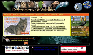 A couple of colleagues forwarded me an email from Defenders of Wildlife who are opening up their website redesign to a select group in Washington, DC—very cool, I love this idea.
Creating a little anticipation to the process is key and asking folks in the neighborhood to participate in the process is great. I like the fact that Defenders, a group I’ve always turned to for guidance when designing donation page(s), creating our newsletter, or communicating with our activists, has extended an invitation to the public to be ‘in a focus group on our new website.’
I think setting the right mood for a redesign is essential for not only getting folks excited about next steps online, but getting them involved with the work. For us, I’m still toying with this idea and have been talking to folks internally about how we can best do this, but I certainly hope we can follow Defenders lead by opening our doors for community input on our national website redesign.
To get started, we’re launching next week our web redesign ‘cat out of the bag’ survey to capture input from our day-to-day website traffic. It may also be cool for folks to call in and leave their verbal suggestions. Anyhow, stay tuned, next week our photo contest goes back up on our homepage and we tackle the next phase of our redesign process: public exposure.
Labels: Strategy
A by-product of this effort to date (kind of unexpected too) is that I’m being introduced to folks in the marketing field.
Okay, introduced may be a strong word, but I’m at least being guided toward notable individuals with significant marketing experience who will benefit my organization’s work online. One notable is Katya Andresen, author of Robin Hood Marketing and Non-Profit Marketing Blog, Getting to the Point. She, along with Alan last month, recently wrote about my effort in her blog, even posted my responses to a few questions. Fun stuff.
I’ve also been reading as of late Beth’s Blog and Getting Attention, two more resources in the field. If there are others, and I’m sure there are, please leave a comment below or in the new ‘Talk to me’ section in the blog bling area.
Labels: Strategy
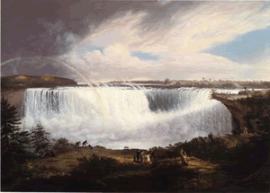 This is not highly relevant to our website redesign, but there are a couple of things that I wanted to highlight with RiversandCreeks’ recent posting, Rivers in Art.
First of all, the blog post was written by American Whitewater’s Pacific Northwest Stewardship Director, Tom O’keefe. Secondly, it’s a great piece reflecting on a recent trip to Washington, DC - the post truly captures the social and cultural implications of rivers in American history.
And, lastly, what I’d like to mention is that aside from an employee writing about his relationship to rivers, the blog itself seems to reflect what I know about American Whitewater: they're a strong community of river enthusiasts.
I’m not sure how many staff members keep blogs in their personal time (or if the organization has a blog policy in place), but I was talking to Tom last week and learned a little more about their efforts online as an organization. Apparently, one person oversees the site and the community contributes to the development of the pages. In fact, there are approximately 300 contributors to the site. That’s a nice number of worker bees to have on your side to help out with the editing and updating of the various pages.
As a conservation organization first, I wonder how we can create a little more dialogue online with our community. And, I can't help but going back to the idea of something along the lines of a Riverpedia, similar to what Techsoup has done with their glossary.
I know we’re the expert advocates when it comes to rivers, but if we’re talking about Fluvial Geomorphology, wouldn’t we want the Fluvial Geomorphology experts to weigh in on the term?
Labels: AmericanRivers.org, History
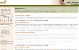 Robert Scoble, the guy who put a human face on Microsoft with his blog Scobleizer, may not have been the first, but he did make blogging popular. Especially since he was doing it from the belly of the beast, cool stuff.
And let’s just imagine that the word Microsoft is interchangeable with Bill Gates (stretch I'm sure), but to the techie audience, I would suspect Robert Scoble is close behind.
However, for the environmental field, not sure who it would be, Robert F. Kennedy or Al Gore? Regardless of the face, I’d like to nominate David Miliband.
Who is David Miliband? Well, he’s the Secretary of State for Environment, Food and Rural Affairs in the UK and his blog, David Miliband, is right on.
What a great example of non-sexy, government website that seeks public input while putting a face (literally) on the work. And in David's words:This blog is my attempt to help bridge the gap - the growing and potentially dangerous gap - between politicians and the public. It will show what I'm doing, what I'm thinking about, and what I've read, heard or seen for myself which has sparked interest or influenced my ideas. My focus will be on my ministerial priorities. This supplements the existing ways of doing day-to-day business with me and my department.
Great stuff and maybe one day we can have departmental blogs that give our program work a unique voice too. I’d love to learn of more folks blogging from within, any leads or ideas?
 I just read Steve Bridger’s piece, You’ve been promoted to “Buzz Director” (what, you don’t have one?), and found it very relevant to our website(s) redesign process. The post reads like a checklist and I’d definitely agree that certain shake-ups from within are key to an organization’s growth online and off.
However, I know there is a balance, but at what rate does one push, encourage, and nudge folks. Staff can probably attest to my proselytizing from within, but how much is too much (and do I want to be that guy too)? Sure, I want to go in this direction, but are we ready for it?
All said and done, I guess you have to pick your battles with the tools you use and the messages you permit to…um, let go a bit. And like most folks in my position, I’m always looking for ways to inject into the conversation additional ideas to present information and create an online community, but the opportunities are not always clear. My response: fabricate these moments by hosting a few brown bag lunches around web 2.0 to push some of the issues to the surface. So shallow, I know.
Our first one was last month and we basically introduced web 2.0. The next one is Friday, December 1, on RSS feeds. This should be interesting as it’s a laptop friendly event and we’ll go through identifying a feed, setting up a news aggregator (we’re using bloglines), and subscribing to it. Since most of the office uses Internet Explorer, IE 7 has made subscribing to feeds a lot easier.
 I started a content inventory late last week and I'm finally done—what an absolutely mind numbing experience. Our national website tally: 1,163 pages. Every page was touched at least once…possibly even twice.
My URL hand-crawl experience (and I feel it too) revealed the following:
Labels: AmericanRivers.org
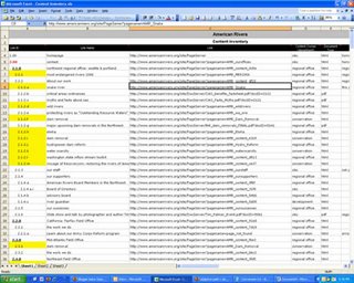 Late last week, I started a content inventory project (shoot me now) for our national site and though my left pinky and forefinger are nearly numb from the continued banging of the ‘ctrl c’ and ‘ctrl v’ function, I have to admit this is a pretty good exercise (discovered a dam cool photo page too) to become intimate with your web content.
And, really, what better reminder than a content inventory that LESS IS MORE when it comes to web content.
As the new guy to the organization (less than 6 months), I definitely didn’t have an idea of the breadth of our footprint online. There is a lot of stuff that is floating around on our domain name and I just haven’t explored every nook and cranny. And honestly, kind of feared it, but knew it would have to happen one of these days.
In an attempt to escape the headache (and added work time), I had the idea of turning this project over to our supporters in a wiki-like format, but it seemed to be more work to set it up than it was worth it. I also attempted to recruit a couple of able bodies internally, but when we sat down and talked about it, I ran into a redundant link issue.
I was a little perplexed (and it’s not completely cleared up either) with the idea of capturing the same link twice—mainly, how it can be avoided. See, our site navigation has a mind of its own as each region/program can lead you to another section, which may eventually lead you back to the starting place—or not. In many cases, the trail simply dies (e.g. PDF wall, page with two external links, etc) and there are no breadcrumbs to return home. And, not that one has to return home, but I believe that regardless of the entry page, one should be able to easily tell where he/she is within the site.
So, I’m following the leads of each section, thinking by doing it myself, I will at least have an inkling of an idea if I’ve been on that page previously, and that way I can stop before I get too far ahead.
I read Jeff Veen’s article and took his advice. Basically, I started at the home page, jumped on the top navigation, and begun diving in…link, by link, by link...by link. Some of our pages have 30+ links on them! Oy.
Anyhow, I’m capturing all of our html/PDF links and to date have roughly 450 completed. And I think I’m a third of the way there too. One toolkit alone had over 150 pages! For the redesigned site, we're shooting for 500-700 total pages.
Hopefully, I’m capturing every thing, but if you have any ideas how to speed this process up or what else should be noted on the spreadsheet, please let me know.
This is the information I'm currently pulling from the site:
Link ID
Link Name
Link
Content Owner (department)
Document Type
General Notes
Wish me luck. If there any additional resources that you’ve come across or tips from having gone through this before, please let me know. Thx.
Labels: AmericanRivers.org, Strategy
 The right photo makes all of the difference and I think we found it. Disregard the previous post and implication that we settled on an image, because we found an even better photo for the National River Cleanup Week's flash introduction.
What makes this photo pretty cool is that there is an actual connection to our efforts; it was taken in 2005 during a cleanup by a volunteer (and/or supporter, employee, etc) of Friends of Coyote Creek. In fact, there are a lot of photos on Flickr pertaining to specific river cleanups (bodes well for us!).
I especially liked Tom's description of the photo:
An amazing assortment of junk collects in these rafts, swimming pool hoses, soccer balls, water jugs, juice boxes, beer bottles, soda cans, spent condoms, and anything and everything styrofoam.And fortunately there are folks like Tom who are active with their local groups. Thanks Tom as these words sum up the need for a LARGE outpouring of volunteer and organizer support in 2007. Stay tuned for NRCW website updates; it's getting to be crunch time.
...During the winter, trees fall into the creek and obstruct the flow. At the same time all of the litter along the streets is washed into the storm sewers and into the creek. The result is the trash rafts.
Fortunately, there are groups like the Friends of Coyote Creek who organize creek clean-ups and do creek maintenance to remove the obstructions to flow.
 The right photo to convey the right meaning is not always an easy thing to agree on. An understatement to say the least, but it’s an important process nonetheless.
It reminds me of choosing the right color of the paint for the bedroom, and though you might like a hint of yellow, your wife tells you that statistically couples are 75% more likely to quarrel in a yellow room. So yellow is out.
Statistics or not, the right paint as well as the right photo is key. For our national site, the top viewed page is our photo album, so images are very important.
We went back and forth with the leading trash image on the National River Cleanup website and I think we’re at a temporary resting place. Looks like we’re planning on keeping the original image [see above] but moving the photo up a bit so that the tires are a little more present, giving the feeling of trash instead polished rocks (i.e. Styrofoam).
This photo is from Flickr and is under a Creative Commons license with attribution, view it’s home.
 How do you improve your organization’s search engine ranking?
I worked for Away.com several years back and I remember coming across the term for the first time and thinking search engine optimization marketing was pretty obscure stuff. Not any more, and in fact, it's a booming business (read The Long Tail).
What I've come away with is that SEO is more of an art than a science and there are basically more things we can’t afford not to do. Leaving link farms and Google bombs aside (remember this is a non-profit, an ethical one at that), link reciprocity is still a must. However, trading links is not really the norm anymore and it's not that easy—why send folks off your page?
Though having our web pages linked from another site is still key, the competition has stiffened and the demand for dynamic web content has grown. Look at blogs, they typically have a good ranking, and wikipedia always comes up above the fold for me. Hands down, content is still king (bodes well for being in the mix and shaping the conversation online than the traditional approach of message control, don't it?) to reach new audiences, but what comes next? For me, this is somewhat of a gray area.
Here's what I know: Approximately 10-15% of our online traffic comes from search engines (and who am I kidding, 90% is from Google). But these numbers are nothing to sneeze at; the above percentage works out to be anywhere from 3,000 to 4,500 unique visits a month. And, if you break it down by our conversion rate, we recruit between 3 and 5 new supporters each month from search engine traffic—I'll save why our conversion rate is low for another day.
So, how do we grow our search engine traffic? Well, first of all, I think Google’s AdWords program is a good start and we are currently enrolled as a grantee. However, I haven’t been very good with the program given my newness and the growing demands of the web team, i.e. additional website redesigns. A big mistake there.
Secondly, create meta data for each page = language that only your website and Google crawlers speak. Um, I haven’t been that good with that either as most of our pages (so I believe) were created in haste and that information was not added.
Lastly, in addition to registering your website on all of the big search engines, introduce your sitemap to Google. To do so, I recently joined Google's webmaster tools and have begun to read the information that Google lays out pretty plainly on how we can best optimize our pages to be crawled by their bots.
Anyhow, take a look at Google’s SEO pages here, here, and here. If you know of anything else, or have tried something a little different that works well, please let me know. Or, include a link to an article in the comment section (you can also add it to my Del.icio.us page).
Unfortunately, I feel SEO is typically an afterthought, but I’d like to address it early in our redesign, so appreciate your input.
Labels: marketing
 I've run this by some key individuals within the organization and the consensus is that this photo is not trashy enough.
Sure, there are tires and styrofoam products in the image, but it’s not that obvious. So, keeping in mind with what I learned the other day, we need to find a photo that contains a stronger call to arms for our national river cleanup website.
Though the trash in our rivers is plentiful (unfortunately), the right sized photos are not.
A couple images that may work are below, but this may take a little time and we’re starting to push the comfort level for when we would like to launch this site…first week in December!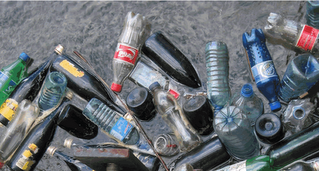
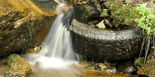

Any of the above photos stand out? The bottom two of are from ShutterStock.com and the first one is a random image from Flickr (which btw had pages of river trash - there's even a group called River Trash). For the Flickr photo, I've got an email out to the owner to ask for his permission - I think it's the best one, but size may be an issue.
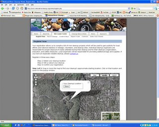 We’ve gone around the horn with the National River Cleanup Week registration process trying to find the most effective one-two combination and I think we’re on to something…a Google map in reverse.
Our challenge has been potentially plotting multiple 2007 cleanups on one river and all within the same zip code too. It's not too accurate and we definitely didn’t want to ask for the cleanup longitude and latitude, so we were stuck with finding the easiest and most precise way to capture an exact data point (2007 river cleanups) for the map.
The draft to date contains a blank map of the US and once an organizer decides he/she is ready to register, they go to the map and zoom in to the exact location and register—very cool.
I zoomed in (photo above) to my home in DC, then moved north a bit, and found the section of Rock Creek in Rock Creek Park that I wanted to organize a cleanup around and clicked ‘Save’. My coordinates were saved and I was then routed to a registration page that asked for additional, but necessary information. After that I got an email to confirm my registration (crucial authorization step) and then it’s up to me to recruit my cleanup volunteers, if I haven't done that already.
This seems to work very well and I really like that this gives the traditionally boring online registration process a little excitement and interaction.
 The flash introduction to our National River Cleanup Week website looks great, however several folks who took a fresh look at it thought it was hard to tell that the photo of river trash was actually river trash.
I’m a little too close to the project, so I’m sort of useless, but more than one person mentioned the tough to tell river trash header. And that's enough for me.
So, we’re looking for another image, but we need a clean crop—a term I recently learned—and to further clarify PuffinWorks.com, our web developer, wrote this:
Attached [above] is a photo you sent me earlier that measures 500 x 375 pixels. I've outlined in red a crop measuring 500 x 100 pixels.So the hunt continues for a good, clean cropped photo of river trash.
A clean crop is one like this that hasn't been compressed or changed in any fashion, but is simply sliced out of an entire photo.
We couldn't take the entire photo and compress it into this 500 x 100 pixel space or it would look squashed; likewise, we couldn't take this crop and stretch it into the size we need for your header image that is 770 pixels wide.
Thus, we've got to have a photo at least 770 pixels wide in order to "clean crop" a slice 770 x 230 pixels.
 I learned a pretty big lesson yesterday. For one of our redesigns in motions, I’ve included the live link to the pages for folks to review our work to date. I’ve just learned that this is poor form.
Over the last few weeks, I’ve been reaching out to various folks for their input and feedback. Well, with our work on the National River Cleanup Week taking shape, I wanted to share my efforts with our designer in Wyoming for his thoughts.
Over the last couple of years I’ve learned a great deal from PuffinWorks.com and have a lot of respect and admiration for the services they provide to progressive nonprofits.
PuffinWorks.com succeeds in providing nonprofits the technical expertise with a persistent 30,000' view. In my experience, either you’re a skilled developer or a keen strategist, rarely both.
Anyhow, when I shared my efforts to date with PuffinWorks.com, I learned of the potentially negative implications of making your test URL links live:
As soon as the Google bot indexes your blog, it will find the page links to NRCW and then attempt to index the pages. You don't want your NRCW pages indexed yet because they aren't complete--those may lead to broken links later if Google fails to remove them, which it frequently does, and thus you may end up in Google's sandbox--one of my clients just emerged after 18 months for a similar offense! Also, I will have to disconnect the form now; we don't want the public accessing this form because I haven't installed any security protections yet.A fairly large bonehead move, so I removed any and all National River Cleanup links from the blog and from now on will only have screen shots. This blog is about sharing my experience and learning from others, but I don't want to bring down the house in the process.
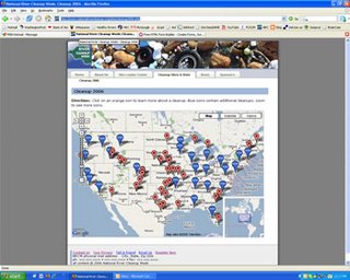 We have a draft of the 2006 cleanup map. We're still addressing the issues noted earlier, but at least this gives us a great visual of previous cleanup efforts. Very cool.
Our primary audience is indeed the organizers, but we also want to attract prospective volunteers by having them search a cleanup in their state. This will be a second map and will allow prospective volunteers to find a cleanup going on near them as well as who to contact.
We just had a larger team meeting with fresh eyes and the feedback was great. The whole website redesign process is like peeling back an onion, corny but true. Basically, we're trying to peel back each layer, one at a time, careful to not jump ahead of ourselves.
I'm finding the trick is staying true to your layer, for example, addressing text while we're finalizing navigation is less than idea, but sometimes inevitable too. And, like many people, I find it hard to focus on one aspect when reviewing a new site, but this is important. I'm thinking I need to enter these conversations with more specific outcomes desired.
This means setting boundaries early on in regards to what we want to accomplish. Just an fyi to myself (can you do that?), but I've always found it hard to determine the best time during a redesign to solicit feedback. And I guess, as this blog hopefully attests to, earlier is probably better than later.
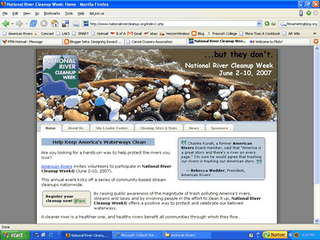 The second draft is complete. For this round, I sat down with our team leader and we went through the site, page by page. It’s not a big site, but took a little time to think about user scenarios.
Anyhow, we felt like the trash photo in the flash header was a little tough to tell that it was actually trash on a river. I've looked at it too many times now, does it look like trash to you?
It would be a little challenging to change it now unless we can find a “clean crop” photo (new language for me). Basically, not any photo will do, we need a photo that fits the header. Apparently compressing a photo to fit the 230px height doesn’t work. Dealing with photos is not one of my favorite web development activities.
We did away with the Contact tab in the top navigation and added it to the About Us tab. Other than that there were a couple of minor changes, nothing too big. The real crux here is the registration process: currently folks register and then once they confirm their username and password, return to the site and enter their cleanup details which will then be plugged on a Google map—cool.
However, there are challenges with that too since Google maps don’t necessarily work very well with a lot of data points. Apparently, Google is trying to fix it, but in the mean time we’ll have to use clusters. Stay tuned, hope to show you a draft of our Google map.
 We’re scheduled for an email blast tomorrow to all of our online supporters who have taken an action over the last 6 - 12 months. It was supposed to go out yesterday, but we got a little backed up with national ‘sends’ that needed to go ASAP.
Anyhow, we’re striving to stick to two national ‘sends’ a week, but we’re monitoring our efforts closely to see what and how our audience responds. Maybe it’s too much or maybe we can send more, just don't know for sure.
During our survey preparation, we decided we wanted a core group of individuals to survey so that we could learn a little more about about our online supporters—this is hopefully just the start. I'd like to get a better idea what make our online mass tick and how they want to communicate with us. Not an easy process, but an important one nonetheless.
The 20 survey questions (btw, I just took an IFAW survey that contained 45 questions—ouch!) were conceived during our first meeting with BBMG and run the gauntlet of organizational needs. Our plan to date is to send this email out and then wait a few days and post a passive survey—same survey minus a couple of questions—request on our homepage to capture the opinions of our passerby traffic.
So, if you have a second, take a look at our survey and let us know if we’ve missed any biggies. What else do we want to know? And remember, these online folks are our bread and butter, so we’re hoping for an above average survey response.
Labels: AmericanRivers.org
Very cool, got the poll from Vizu working this afternoon. For some reason I was getting a server error from Vizu and couldn't complete my poll last night.
Anyhow, if you look down and to the right in the blog bling section, you'll also see the poll. It would be a cool idea to have something along the lines of 'Rate this page' at the bottom of some of our content heavy pages, similar to what Environmental Defense does (btw, cool YouTube video). I like what ED does across the board. What's that saying again? Oh, yea, steal shamelessly!
Thanks NonProfitMarketing.com and Beth's Blog for the Vizu lead here, much appreciated.
Labels: Web 2.0
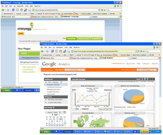 Last week I wrote about trying to decide what reporting tool we would want for our redesign(s) and I think I have an answer, both. Why have just one when you can have Google Analytics AND Crazy Egg.
Honestly, it seems like it is a good idea to have two systems in place so that there is a bit of checks and balances with web reporting. And, Crazy Egg has a heat map, very cool.
At first the heat map wasn’t working properly and my clicks were sky high compared to Google Analytics, but after rebooting my effort it worked and I can see where folks are clicking on the blog. Very cool if you want to test a new design to see what visitors like and where they go.
I’m still trying to test out a few pages on our national site, but it currently doesn’t seem to be playing nicely with Convio. Or the other way around. But then again, I have not ruled out human error, me.
Labels: Web Reporting
I have to admit, I'm enjoying my social media experiment—um, blogging—a bit more than I thought I would. It’s hard not to feel a small widget of dork-pride in the process, but don't worry I haven't had to hold any calls due to my blogging.
Anyhow, I’m reading Katya Andersen’s book, Robin Hood Marketing: Stealing Corporate Savvy to Sell Just Causes, and the read is very good timing as my organization is currently going through a large branding exercise (hence the website redesign), so I naturally catch myself folding pages for future use. I find the layout and organization of the book extremely user friendly—I’m a sucker for bullets, bold, and numbers when breaking down a new subject area.
So, I just learned of Katya’s blog and enjoyed (and wholeheartedly agreed—we’re guilty of it too!) her post on YouTube for nonprofits. Some excellent points for us to remember as we hope to add new videos to our YouTube channel.
Labels: YouTube
Cool stuff. Alan Rosenblatt's blog, Dr. DigiPol: Caring for Politics in the Digital Age, had some nice things to say about what I'm attempting to do here. It was very much appreciated as well as his efforts in the advocacy field to bring folks together for roundtable discussions.
However, I do want to make it clear that though this blog addresses some of the changes within my organization, it is separate from the organization. My intention is to keep the focus on the process of a website redesign and not the organization. Thanks, had to say it again.
This is the stuff that I know about, but I'm sure there's more. Check out some of Alan's work here, here, and here.
 Last August I visited Convio in Austin, TX, and asked them when they would fix their RSS feature—I could never get it to work properly. At the time, it seemed pretty shabby, but I don't think many clients were clamoring for it. However, to their credit, Convio addressed the faulty feeds.
For this blog, I wanted to test out Feedburner for our future web work, so I signed up and got the ball rolling—look down and to the right in the blog bling area. You can add the feed to your news reader / aggregator or sign up to receive new posts via email (a new feature that is very cool). And, what’s great about Feedburner is that I can track everything!
I was a little bummed that I couldn’t use this service on our national site since we’re working within a closed box, Convio. Anyhow, I just assumed we couldn’t utilize Feedburner until a friend said:
Mmm. Couldn't you just burn a feedburner feed from a working feed? In other words, burn a feed from a feed? If that makes sense?Duh, perfect dorky sense—hadn't thought of that. Thanks man (you know who you are) and we're doing just that now, burning a feedburner feed from a working feed. Cool. I really want to track the subscriptions since our reporting metric indicates the Convio RSS link is one of the more popular links on the site—I find that a little surprising, but maybe we’re on to something here.
Labels: RSS
 From what I understand about our website to date is that it’s been largely reacting to organizational needs.
To a certain extent, this is expected as the web is the primary means in which we reach our audience(s) and typically comes in to play after some big event. However, as we move forward I hope we can become a little more proactive with our attempt to connect our supporters to new river developments.
For example, last week senior staff talked about how we planned to respond to the 2006 elections. We batted around ideas, but failed to come to a conclusion or a plan of action. We talked about emails, photos, quotes, and even video, but as time wound down, I ended up waiting until the very last minute to do anything.
On the morning following the 2006 election (still in a shocked stupor from the previous night’s vote tally), I realized that the web was not prepared to capture the events.
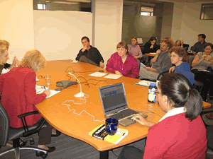
So, with about 30 minutes to spare before our president was to address the organization, I rushed out and bought a $20 microphone while my colleague downloaded www.audacity.com, free audio software. We planned on at least audiotaping the event, then uploading it to Gcast, a free podcasting service, and eventually posting to our site. We have no home for this on the site, but wanted to do something.
Well, it smelled of a disaster from the beginning. There were lots of folks involved and with an equal number of ideas, but no clear direction and many changes along the way. I already felt like I was backpedaling once the election neared and had not taken ownership of the web side of things. In the end, we added a homepage header, created “a letter from the president,” and sent it to our online activists. Not too bad, but it felt like a great deal of energy was spent after the fact.
I’m not a big golfer these days, but it basically felt like we hit the green with a low riding screamer; it wasn’t pretty, but in the end it worked. That’s not the way I hope we move forward with future web developments.
Labels: Strategy
 I can be persistent, and at times impatient, but I’m really jonesing for my organization to test out a wiki. There’s a lot of buzz floating around wikis (great podcast) online, and everyone knows within the organization that I’ve been proselytizing like no tomorrow, but can we take the leap of faith…let go of the notion of message control?
I’ve been trying to pitch various uses of wikis within, such as Riverpedia, Toolkitpedia, MERpedia, or and Outreachpedia, and though there’s been interest, I can’t land the kill. I’ve been putting on the hard sell and it’s got to be getting annoying, but I’m pretty eager to give it a test run outside of our organization.
My latest idea: dress up the wiki as a spreadsheet and ask for the public’s help to map out our national site’s information architecture (IA) by conducting a content inventory analysis. I’d love for folks to weigh in on this process (like, um, the blog here) and help us break down the pages that live on our site…the building blocks for the redesign process.
Can we really turn our visitors, online activists, and supporters into virtual volunteers—working at their own pace? That would be cool and it even plays in to Tim Reilly’s #4 core competency.
Labels: Wikis
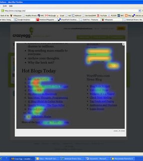 We're testing out two different reporting mechanisms, but man they’re off. I really like Google Analytics and have been using it to gauge interaction for this blog as a larger test for the redesigned pages of our national site.
However, I’m a big fan of cross referencing web reporting metrics, so a friend suggested I try Crazy Egg which gives you the first 5000 pages free. And, along with that you get some pretty cool visuals, like a heat map. I love the thought of a heat map—sort of a poor man’s version of eye-tracking—to get a sense of what draws attention on a page. This is great for testing new designs and figuring out what is hot (no pun intended), but the trouble is that I can’t quite get it to work properly. Arrggh.
Fortunately though, boldly placed on the top navigation bar is the link, “Report a Bug,” so I did—which, btw, seems too well placed. Not sure what is up with the heat map as well as the counter, but visits reported by Crazy Egg are 20x greater than my Google Analytic visits. That’s a pretty big discrepancy.
And, I won’t even get in to Convio’s reporting mechanisms, yuck. Not that I know a great deal about manipulating data (though I’d love to learn more), I get the sense that AWStats kind of bites for drilling down for more detailed information.
Labels: Web Reporting
 Tim O’Reilly’s list of core competencies that define Web 2.0 is interesting to ponder as we embark on a redesign that will be contained within a closed system, Convio. However, what is interesting to note and remember as we move forward is the fourth rule: Harnessing collective intelligence.
From our brown bag lunch last month, we were hopefully able to demonstrate that Web 2.0 is a philosophy. Though we may be limited—trust me there are many perks too—with our proprietary software giant, Convio; we can at least attempt conduct our redesign with the premise that everyone who visits our site has value to add. The trick, however, will be giving them the opportunity to do so in a clear, concise, and engaging manner. But I guess that's the fun part too.
Web 2.0 core competencies:
 I recently learned about Alexa and found that our national site traffic rank was 909,229. Ouch, almost wish I didn’t see that, but on the bright side of things, we can only go up.
I'd like to know of other ways we can measure our online footprint. I think this is an opportunity to take some baseline vitals early in our redesign process and and share it with others in the hopes of demonstrating growth online down the road...specifically, during our FY07 budget session (March).
I've got to begin creating some metrics for our work online if I ever hope to grow the program within the organization.
Some more cool stuff to know:
Speed: Very Fast (80% of sites are slower), Avg Load Time: .9 Seconds
Other sites that link to this site: 475
Online Since: 29-Oct-1998
To put our traffic in perspective, some of our ‘competitors’ are below:
Labels: AmericanRivers.org, Web Reporting
NationalRiverCleanup.org is beggining to take shape. We have a first draft of the site and will look it over with folks on staff this week as we're still shooting for a December launch (though November would be ideal). Our designer is still working on the maps, but at least we can start reviewing the existing page content. This will be a work in progress.
We met with Bemporad/Baranowski Marketing Group (BBMG)—the firm leading our branding and 'web look' efforts—again late last week to follow up with our online activist survey. Though we've had a session with BBMG early last month to gauge staff wants / needs, this will essentially kick off the user side of our re-branding effort.
We're shooting for a November 13th email survey to the targeted group—those who've taken action in the last six months—and will post a link on our website to capture the viewpoints of our traffic. (Btw, I saw Washington Area Bicycle Association do this and thought it was pretty cool—though it’s been a few months and I haven’t heard a thing. I read the blog daily too!).
Anyhow, I hope this will at least let the cat out of the bag that we’re planning a website redesign. The survey questions are below; are we missing anything?
PART ONE [Issues & Activism]
1. What is the most important U.S. organization that comes to mind when you think of the environment?
2. What is the most serious threat facing rivers in the United States today?
3. What would you most like to see American Rivers accomplish over the next year? Over the next five years? [Open-ended]
PART TWO [Perceptions]
4. What American Rivers focus area most inspires you?
5. How would you describe the organization’s greatest strength? What about its greatest challenge? [Open-ended]
6. If you had to summarize American Rivers in one word, what word would you choose? Why that word? [Open-ended]
PART THREE [Donations & Benefits]
7. In your view, what is the most compelling reason someone should join American Rivers?
8. What is the highest minimum membership level you would deem reasonable to join?
PART FOUR [Web Communications]
9. How often do you visit the American Rivers website?
10. Which section of the website do you use the most?
11. What content would you like to see covered more thoroughly on the website?
12. Of the following, what environmental websites do you visit most often?
13. Outside the environmental arena, which websites do you visit most often in general? [Open-ended]
14. In general, what do your favorite websites offer that American Rivers’ website does NOT offer?
PART FIVE [Demographics]
15. What is your gender?
16. Which category best describes your age?
17. Which category best describes your race?
18. Which category best describes your level of education?
19. Which category best describes your annual household income?
Labels: AmericanRivers.org
I've added Designing Inward Out to Feedburner as well as included a 'Subscribe' link for those who don't have a news reader / aggregator set up. Very cool. And, as I'm continually learning more about Del.icio.us, I've added a tag cloud to the blog bling on the right. This will hopefully serve as a great resource for me (and hopefully others) as my organization goes through multiple website redesigns.
Labels: Social Bookmarking
Currently, our national site boasts a glossary link, but it goes to USGS’ website. That’s less than ideal. And, one of better pages that define the various terms used in river conservation work is on a website that has been on its way out, restoringrivers.org.
The staff survey we did last month revealed that over half of my co-workers felt we do not speak to our newbies, first time web visitors, well. Not sure if a running list of river terms breaks down those barriers, but what if our river glossary was dynamic. Yup, a Riverpedia. That would be pretty cool. We could capture all of the terms relevant to river conservation virgins to the leading professionals—and the professionals could help us edit the list!
We’re already exploring wikis internally for document control purposes, but I really like the idea of exploring a Riverpedia. This would first of all allow anyone in the organization to add new words, edit existing ones, and / or manage pages relevant to their specific work. I really like the idea of decentralizing knowledge…as well as the need for multiple updates to be completed by the web team.
Techsoup has a new glossary that is a great example of how we could structure our Riverpedia.
Labels: Wikis
Again, all of this is a testing ground for stuff we're beginning to experiment with as we go through our website redesigns.
The podcast tool I'm using is Gcast. They provides a free service that is extremely easy to use and one that can be done on the fly with a cell phone.
Interviews would be pretty cool. Maybe, I can chat with some of my co-workers as we go through the redesign process or better yet, some of our supporters - possibly even the design consultants, developers, and firms we're working with.
We have though begun testing the use of Gcast internally with field reports and we recently launched a Tim Palmer interview in our monthly newsletter. To date, we've gotten some pretty good feedback from folks.
I like the audio intro, but over the coming weeks I'd like to try a video introduction...in a van down by the river. I have no video editing skills, and in fact, have never attempted to edit video or let alone shoot video. But I'd like to learn as well as test out these.
Labels: Blogs
I swear, this is not from the Onion: Gov’t launches a "top secret" Intellipedia system.
I see this as somehow reinforcing the use of wikis; albeit, a little scary when it comes to national security, but cool. Over the last few months I’ve attempted to spread the wiki cheer around the office. And, there have plenty of soap box moments—a little embarrassing in hindsight—but I get pretty excited over this stuff.
I think there is great potential for wikis in the workplace. Good god, with the amount of document trafficking we all do, wouldn’t it be nice to receive just updates? As well as cut out all the useless emails—I think 25% of my day is spent hitting the delete button.
Fortunately, I think some of it may be sticking. Every April, for the last 20+ years, American Rivers releases a report titled, America’s Most Endangered Rivers. It’s a big time suck for us, but an endeavor well worth our effort. Basically, it’s our trump card—we generate (and get) a lot of attention when the report is released. It has essentially become our biggest branding opportunity too. We see 5x as much traffic over a few days and reporters—not to mention groups too—can’t wait to get their paws on the names of the rivers before the report is released. Confidentiality, to say the least, is huge.
In fact, I just received the folder of the rivers who made the first cut, and it’s marked with a big CONFIDENTIAL stamp. After the proposals are scrutinized, the selection committee will narrow the list to eventually 10 rivers.
After that, we work extensively with our partner to gather more information, e.g. text, photos, graphics, etc. And thus, the challenge for us, is managing the flow of information. And all of this has to be done in complete secrecy.
How do we manage this process? We went around with a few ideas and wikis made it to the top the list, for now. Of course, when I saw an opening, I started pushing for completely opening the communication channels and creating a blog. Easy cowboy. Not smooth, so I decided to give it a rest for the last couple of weeks. But, I’ve decided to hit the war path again.
I’d like to lay on the offensive for creating 10 private wikis, one for each river. There are a couple of candidates, Wikispaces.com (we’re currently using a private wiki internally for our department), Jot.com (just bought out by Google), and Socialtext.com (just learned of it today).
Not sure what the best fit for us will be, but I’d love to test it out…like this blog, it’s somewhat of an experiment.
Labels: Wikis