Wednesday, January 31, 2007

Snapping Snap in half: no more (annoying) page views

I should have listened to my gut. When I wrote about Snap in December, I thought I found a win for the user (they get a preview of the site) and for us (one more attempt to keep them on our site).

Well, it's only been a couple of months, but I'm less concerned these days about driving folks off our site and more interested in our redesign building a relationship that fosters trust around the notion that we are the premier source of river conservation, news, and action. Ideally, I'd like our new site to serve as a platform for communities to share, learn, and act on river issues on a federal and a local level.

With our focus on trust as we move forward, users should want to return to our site. There is no need for trickery, annoying pop ups, and opening new windows (ok, haven't totally let go of this one - I'm trying though). If we build a solid, easily navigable, and useful site for our audiences, they will come back.

I was already leaning toward this thinking, but after two unrelated reads, Scobleizer and Lifehacker, I've decided to snap Snap in half from future pop ups on this blog.

One minute how-to podcast: understanding RSS

This is a great site, one minute how-to podcasts from 'How to cook a proper steak' to 'How to look like a zombie' to 'How to write a resume cover letter'. There are over a 100 podcasts on the site that recently won a Podcast Peer Award.

And then there's my personal favorite, 'How to prepare a Guinness for consumption'.

Last week, I did a one minute how-to show with George on 'How to create a Web 2.0 org'. It won't be out until the middle of February, but it was a pretty cool experience (when my Skype headphones weren't on the fritz). We're also planning on a one minute how-to on 'How to organize a river cleanup' to help us promote National River Cleanup Week.

But I digress. Today's one minute how-to was 'How to understand RSS' which was great and I love the analogy to TiVo. We're planning on having several different feeds for our redesign, so the more this type of information gets out the stronger (IMHO) our communication efforts will be targeting our intended audience, community leaders.

I've been spreading the gospel around the office (to the annoyance of a few I'm sure) and this is a perfect opportunity to reach out one more time to follow up with our RSS brown bag last December. I'll probably also include Marshall Kirkpatrick's Intro to RSS which is a great piece.

Tuesday, January 30, 2007

Out with the old, press conference...in with webcasts?

We're exploring the idea of a webcast for the release of our annual report on America's Most Endangered Rivers and I've gone to the usual suspects (here, here, and here) for info, but can't find many organizations who've utilized this tool.

There is a lot of cool potential (and hopefully savings too) for maximizing our opportunity to highlight this year's 10 most endangered rivers. I've found one in the area, but they won't return my calls. When was the last time you couldn't get a sales rep to call you back? I've left three messages too!

Basically, we're looking for a turnkey package that includes hosting, some interaction (live chat?), and is PowerPoint compatible. This is a test for us as we look to create a little added excitement surrounding the new website (planning on launching the first week of April) as well as this year's listing of 10 Most Endangered Rivers.

Anyone have experience with streaming live video? Thanks.

Organizing information for web design

Last week Beth pointed me to a great read, Non-Profit Tech Blog: Confessions of a Non-Profit IT Director. On Sunday, Allan's blog post gave me a great call out and had some good questions for me to ponder as we move forward with our redesign(s). He wrote:

What I would like Chas to show is his toolset for web information architecture design. Does he use Visio? Does he brainstorm on paper? Does he use index cards? However, he certainly he gives out enough information for people to eventually replicate his work methods for themselves. Hint, hint, I’ll be doing some of that myself.
First of all, I’ve never heard of Visio, so that was cool. And, index cards? I’ve never thought of that, but if it worked for me in elementary school and for my wife as she went through law school, then by golly it should work for me at the office.

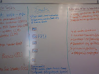
I'm not sure if this completely addresses the question, but my preferred method (I use ‘preferred’ loosely as I haven’t dabbled with much else) is whiteboard, note taking, and meetings - a little old fashion wouldn't you say?

Whiteboard – Every Thursday, the web team meets and discusses web work completed, web work that needs to be scheduled, and upcoming week’s email schedule. Shortly, we will be including an editorial calendar to the mix (any successful models would be appreciated).

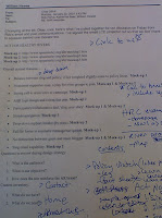
Note taking – I write a lot and cross out even more. I also carry a little ‘dorkpad’ around with me to capture tidbits outside of the office, e.g. sites to visit, folks to contact, shower-moment-thoughts, etc.

Meetings – For us, the web has been a huge patch quilt over the years absorbing lots and lots of information. So, my task early on (and hasn't stopped) has been meeting with folks to learn more about what they do, how our site(s) can reinforce/promote their work, and learn what we can do to integrate our work more efficiently and effectively.

Why am I going through this? Well, basically, Allan has me thinking about my 'toolset' as well as how I organize the information architecture, balance needs vs. wants, and better integrate our work online. And how I bring people into the process, that's also key. I will also look into Visio, but I’d like to hear what works for others. Editorial calendars? Wikis? Intranets?

Monday, January 29, 2007

AHR mock-ups reviewed, desired design elements explored

The Act for Healthy Rivers team met again last Friday to discuss the mock-ups. We had a great meeting and it was the first time all of us have sat down and accomplished what we set out to do over the typically short time together (finished early in fact!).

This was not because we had a hard time agreeing in previous meetings, but up until now the project was still too ambiguous. This meeting had legs from the beginning as we finally had something to wrap our heads around. Instead of proposing 'what it could be', we were finally getting a glimpse of 'what it will be'.

From my first day at American Rivers, we've been talking about this project, fighting for its funding, and making our case internally why it was important. That was eight months ago and even I came in the 5th round, so this project has been bubbling for well over a year.

This past July we decided to put this project to paper and write a Request for Proposal (RFP). After hallway chats, meeting requests, and email galore, we laid out what we wanted (applications and all) and tossed it to 10 different firms. And we got 10 different proposals. It was everything from a 6-line email to a binded 40 page report (ouch!). The proposed project budget was also all over the place. We mulled over each proposal, responded to follow up questions, and further attempted to identify what Act for Healthy Rivers meant to the organization, steering committee, and prospective river groups who join the campaign.

The funny thing is that where we are now is nowhere close to what we envisioned in the RFP. However, going through this process helped us to 1) identify our developer/firm for the national site, 2) further grasp the project goals, 3) find a gritty, campaign proven firm developing exclusively on Drupal.

Since basically October, we've had multiple meetings with our design team that have gone on many tangents (we are talking about sewage, so all fun), and all of it has lead us to where we are now, project mock-ups for our 'river group' site.

Our meeting on Friday touched on the following:

Mock-up 2 was the preferred design template, but there were elements of the other two (here and here) that were equally as attractive for AHR’s look, feel, and navigation.

Our discussion revealed the overall desired design features for moving forward:

  • Greater balance between slog and policy (if not weighted slightly more to policy focus)
  • Horizontal navigation
  • Prominent supporter map, a play for river groups to join
  • Strong call to arms intro to campaign, our “manifesto”
  • AHR logo design and colors that pop
  • Participatory/collaborative feel, 'slog your story'
  • Simple navigation
  • Drop-down support locator (by state)
  • Full/fat footer to reinforce message/navigation
  • No distinction between guest and main blogger
  • Slog email capability

Wednesday, January 24, 2007

Wrapped up wireframes (this time I'm serious)

We've hopefully taken our last spin with the wireframes and sitemap for our national site. Though it's been over a month and stops here, here, here, here, and here, I think we're at a good place for moving forward. I devoted a little more time to this stage than I had planned, but I thought it was important to flesh out some of the building blocks due to my newness to the organization, partnering with two fairly similar marketing firms (one for design, one for build out), and the amount of outdated pages on the existing website.

Next week is our board meeting and we're planning on releasing the homepage mock-up, colors and all. Pretty cool stuff, but once it's out to the board and organization as a whole, we're off to the races between now and the first week of April to launch the new digs. It doesn't feel like a long time, and it's not, but figuring out the bells and whistles vs. our immediate content needs over the next couple of weeks will be crucial.

As we finish with the design elements, we're preparing for the next step with our second design marketing firm, The Elemement Agency. They will basically bring us home by attaching code to our designs and then import the design, content, and bells and whistles to Convio - a variable I haven't completely wrapped my head around. But it's something I'll have to do very shortly.

Please see below our most recent 'final' wireframe and sitemaps below:

Tuesday, January 23, 2007

Three mock-ups to review for Act for Healthy Rivers

It's been a while since there's been work to discuss, but we're making good progress with Act for Healthy Rivers' transformation from The Citizens' Agenda for Rivers. After what feels like months of strategy (and we needed every bit of it), we have three mock-ups to review and discuss as a team before providing our partners with feedback for moving forward with the build out.

Act for Healthy Rivers has great potential to speak to river groups, organize organizations around right to know legislation (sewage in our rivers), and energize the river constituency to act for healthy rivers.

With this in mind, we're looking at a two-prong attack with the first website to focus on river groups, our primary audience, and then a second website this spring targeting Joe public. It is really important for us that our river group website is the product of the community, i.e. steering committee and river groups at large. One way we hope to address this is through a sewage log or more appropriately, slog.

For the last month, our team has been slogging so that we can launch with a dozen preloaded posts. This will be pretty cool and hopefully a good example of us igniting a larger, public conversation (and second website) around right to know legislation. More to come with the Joe public, but the mockups are below. What design stands out for you?

We're meeting on Friday to discuss with the team, so hopefully, by the end of the week, we'll be one step closer to our look, feel, and general direction of Act for Healthy Rivers' new website.

Mock-up 1

Mock-up 2
Mock-up 3

Friday, January 19, 2007

Tips we can use from "The 59 Smartest Orgs Online"

We’d like to be smart too, so I’ve reviewed The 59 Smartest Orgs Online and came up with the top 10 things we can do in preparation for our website redesign. Or look to do in the coming year(s)—I’m trying to be realistic. But some very cool ideas to strive for in the weeks, months, and years ahead. The order below is of no particular interest.

Hats off to all of the organizations mentioned in The 59 Smartest Orgs Online (why 59 though?) and their good work incorporating a sense of community in their day-to-day efforts.

  1. Engage constituents through a Google interactive map. New York City Coalition Against Hunger
  2. Encourage small donations through MySpace, YouTube, message boards. ASPCA
  3. Utilize blogs and videos as recruitment tools for volunteers and interns. Doctors without Borders
  4. Incorporate Google Earth video tours. NRDC
  5. Tell stories to keep visitors connected to your work. Interplast
  6. Create a transparent tell-a-friend feature. Bookcrossing
  7. Entice use of e-cards through user-generated photos. TNC
  8. Showcase use of RSS for Radio, podcasts, and blogs (staff field journals). World Vision
  9. Create volunteer-led special events across the country and online. Share Our Strength
  10. Reach new audiences through mobile activism (cool wiki too). Mobile Activism
* One little note in regards to The 59 Smartest Orgs Online: what a pain to find the highlighted tool online since all of the links went to the homepage. For some, it required a bit of searching once I got to the site, but nonetheless, identifying 59 orgs is awesome! And a great benchmark for us.

New homepage wireframe developments

Greater discussion on the homepage has produced two new drafts. The big difference from our first round is that we've added a few extra bells and whistles.

In round two, we addressed the following:

  • A quick link drop down menu for our "In Your Region' section.
  • Changed 'River Basics' to something a little more clever, 'Riverpedia'.
  • A direct link to our signature campaign, 'America's Most Endangered Rivers'.
  • Added 'What You Can Do' to already existing 'Donate Now.'
  • Changed 'Hot Topics' to 'Outer Banks' (the proposed name for the blog).
In the third round of edits, we made a couple of additional changes after a few more meetings and a little more discussion with our team leading the design build out. The biggest question for us was whether or not we include a big 'Donate Now' link on the top left navigation. If we did, that would make four separate entry points to 'giving' on the home page.

Grant it, we want to make giving a very simple thing for people to do, but paired with 'What You Can Do' in the left navigation, it seemed to be a little overkill (one of the things you can do is donate to us). I felt that having a clown nose donate button on the homepage (remember that there are 3 other entry points) wasn't necessary because:
  1. Already reinforced on the header, top bar, and what you can do link on the homepage.
  2. Does not specifically speak to community leaders, first time visitors, and river partners. Greater emphasis is on developing a relationship with our users, building rapport that encourages them to return to the site, learn more, and get involved—not just give.
  3. Online donors are younger (avg age is 40: network for good study) than offline (tend to be 60+) and are becoming increasingly more savvy with link placements, i.e. clown noses are less needed now than before.
So, for now, the 'Donate Now' link on the homepage left navigation has been removed, but I sense this will not be the end of the discussion. Other changes included:
  • Name of our blog 'Outer Banks' to 'Water Log' or Water Blog'.
  • Changed 'Free Stuff' to 'Fun Stuff'
  • Added 'Shop' to the bottom of the left navigation.
  • Moved 'Contact Us' from the header navigation to the footer.
  • Changed 'Riverpedia' back to 'River Basics' - a little too cute.

Thursday, January 18, 2007

It ain't pretty, but hopefully it's effective

I feel like we're spending a lot of time on the site map/wireframe phase (see the first draft here and here), but I can't help to think that unless we have a rock solid foundation for moving forward our work online may get lost in the shuffle (lots of cooks, revamped focus online, and lots of old, old pages on existing site).

I think developing a sound platform (remember I'm new to the organization) is one reason why I feel so strongly about vetting this process to our focus group, field offices, executive staff, and online community. We're at the crossroads (this project can go many different ways) and I feel the more eyes on the prize the stronger our efforts will be.

Some of my notes are below:


Regarding the image above and below, here's what I've learned (good to keep in mind our objectives) from my interactions:

  • We need better representation of our field offices, i.e. 'In Your Region'.
  • Our organizational campaigns are different than our 'outreach' campaigns.
  • We want dynamic content, e.g. blogs.
  • We want RSS capabilities.
  • We want to utilize existing engagement tools for our 'River Basics' section.
  • We want to give our programs/campaign work a voice in the community.
  • Given the response to our survey, we want to prominently display our action alerts.

In response to the homepage draft above, we've eliminated the clown nose 'Donate Now' button, our signature Most Endangered Rivers campaign, and redundant page links from the left navigation bar.

This is a fairly typical C-frame creation, but I like the direction of where we're going and what we can do online. We have quick links to 'In Your Region' and 'Research Tools' as well as added 'What You Can Do' to the left navigation.

Wednesday, January 17, 2007

To add value, we have to begin talking

I think for us pretty simple: if we want to work with communities, we better start talking to communities.

This is one reason behind our push to increase our efforts on the ground by adding the number of field offices, partnering with local groups, and reaching out to community/civic leaders. Basically, we're betting that a centralized, top down approach to conservation (similar to politics and entertainment) is safely on it's way out. And while the old web was about "web site, clicks, and 'eyeballs,' the new web is about communities, participation, and peering" (I'm reading Wikiomics and loving it so far).

Our community-centric approach may be a shift in perspective, but for the web it's exactly what we should be doing. If we want to be leaders in the river movement, we need to add value to the existing conversations. And if they aren't happening (and they don't appear to be), we need to create value by starting the dialogue. Last month, Blogging for meaningful discourse, I wrote about our need to define blogging for us. What does it mean? How do we proceed? What do we say?

Fortunately, we're starting to address these questions with our review of the website wireframes. Our homepage design currently boasts a 'hot topics" section that is probably the best real estate on the page. For this corner of the website, this is where I hope we can define blogging, create a voice, and shape the conversation around communities and their rivers (and of course our campaigns).

How that will take shape is not very clear, but the internal organizing and political positioning for our effort to "talk" online has begun. In the web corner, we have two confirmed bloggers and we're working on two more. Prior to the launch of our redesign site on April 1st (our goal), I hope to have several posts in the can and eight committed bloggers.

I think a happy hour session on blogging (I'm through with brown bag lunches!) and what it means for us will be in the mix for January.

Tuesday, January 16, 2007

Redesigning with Flickr on our mind

Since we're having so much fun with the Flickr photo contest, we've extended the deadline to February 28th. So far, we have over a couple hundred photos and a few dozen "members" in our group. Not bad for our first run at a digital photo contest, but the real benefit to us has been experimenting with a photo sharing site for our redesign.

Our photos take up a lot of space on our server which is not a huge concern right now, but wait until we we start editing videos in house (our IT Administrator will cringe when he hears that). Sure, there are server benefits for us, but having photos on Flickr also gives us the freedom to interact with others who love rivers and want to share their experiences. Basically, another attempt at online community involvement. And, photos make pretty good sense as our work does involve a celebratory component - have to love it before you can protect it, right?

In addition to the contest, we've also migrated all of our web photo albums (our photo albums are viewed the most) to Flickr. And, if we decide to incorporate Flickr on our new site, we can do so by creating 'set' badges (batch of photos specifically related to one issue, region, etc.).

Wednesday, January 10, 2007

The showdown: feeds vs. email

This redesign process has made me hungry for feeds. I eat them in the morning, at lunch time, and at night. Really Simple Syndication (RSS) has definitely changed the I receive my information, attempt to stay on top of my field, and enjoy my momentary breaks at work. My appetite ranges from BBC world news to techcrunch to ZeFrank. And the more feeds I devour, the less I read the paper stuff: Washington Post, Newsweek, The Economist, etc.

I've even evangelized the use around the office, at home (it's a sore point now, don't ask), and with friends. As we're going through the redesign, I'm constantly thinking about how we can RSS-ize the experience. But how much is too much?

When I search our partners, there aren't many who are using them. But even those who are, I wonder how many readers are even subscribing to the feed. And does that matter? The eNonprofit Benchmark Study reported in March 2006 a 10% drop in email open rates for non-profits; could the growing use of RSS and desire to control flow of information be one factor for the drop?

I'd like to think, but I don't believe email communication will ever be replaced by RSS (shucks). I know Feedburner has the option of tracking feeds, but we don't pay for that service. I would however, like to see some statistics on the use (Anyone, anyone?). For us, 12% of our audience surveyed said they'd like more dynamic content/RSS and another 26% said they would like more frequent updates.

If 38% of our audience wants regular updates, I will assume the same 38% also wants a way to manage those regular updates. I'll consider these folks as our prospective RSS audience. Not a bad size, but then again 62% still want our emails. Jacob Nielsen wrote:

Feeds are a cold medium in comparison with email newsletters. Feeds do not form the same relationship between company and customers that a good newsletter can build. We don't have data to calculate the relative business value of a newsletter subscriber compared to a feeds subscriber, but I wouldn't be surprised if it turns out that companies make ten times as much money from each newsletter subscriber. Given that newsletters are a much more powerful and warm medium, it is probably best for most companies to encourage newsletter subscriptions and promote them over website feeds.
This make sense to me since I rarely remember where my information came from, but regardless of the source I still want the information. However, for those who continually provide me with the most targeted, relevant information, I will remember you, you, you, you, and you.

Tuesday, January 09, 2007

Added clues (wireframes) to the redesign puzzle

More wireframes are below, so I’ll be short. It’s great to see this stuff, wrap my head around it, and have things actually take shape. Previous work: sitemap and homepage wireframe.

As we move forward with additional design elements, several preliminary recommendations are noted below:

  • Reorganize the site’s content to focus on the user and allow for easy access to the wealth of content and tools available.
  • Provide a site environment that is accessible, user-friendly and engaging, and that fully leverages the components of the new AR brand message and visual identity.
  • Create a logical, uncluttered interface, with clear navigation and page layouts that display as much significant content above-the-fold as possible.
  • Find ways to elevate the content that users find most valuable (e.g., Action Alerts); find a way to archive content that is out-of-date or less relevant to users.
  • Create a site architecture that is sufficiently flexible to support future content growth.
  • Deploy your content management system (CMS) more widely to allow content to be added dynamically to campaigns, regional offices, etc.
  • Look at streamlining and upgrading the online store as much as possible.
  • Establish an online style guide that conforms to new brand standards.
  • Ensure that AR staff is clearly informed of issues or decisions affecting content or technology development.


Monday, January 08, 2007

Yes, even this is part of a redesign

A good hard look at anything you do will produce some interesting questions. And some not so interesting (but necessary) questions, like how many spaces after a period—one space or two?

This was a fun discussion that split various members of our Outreach & Communication team into two (the week before the New Year was pretty slow).

For myself, I've always been a monospaced kind of guy, but many of our organization's publications have two spaces and it throws me off, so I did a little research and found that the two space-method is old school with the non-proportional typewriter typeset, courier.

But don't take it from me, Ask the English Teacher says:

In the long-gone days of the typewriter, we always put two spaces after a period at the end of a sentence. This was a usage more or less required because every letter took up the same amount of space--an i took as much space as an m. (If you ever use the Courier typeface, you know what it looked like.) So two spaces at the end helped to distinguish a sentence-ending period from a period in an abbreviation like Dr. or Mr.

Most computer typefaces, however, give each letter just the space it needs. So, like the text in books and magazines, we need only one space after a period at the end of the sentence. I confess it took me a couple of years to break myself of that two-space habit once I'd shifted from typewriter to computer.
There we have it, one space from here on out (at least for the web side of things!).

Sunday, January 07, 2007

A yummy link roll to showcase media hits

Over the last few months, there have been some excellent opinion pieces and news stories published on our issues (result of some pretty savvy media maneuvering by the field and DC folks), but we haven't been able to capitalize on the moment as well as I think we would've liked online. Our method has been to post the links on internal pages, add to the homepage, and/or include in our monthly newsletter.

Though this has worked, it's less than ideal as it potentially creates confusion online (link here, but why not there? What's the context?), false sense of expectations (users associate dates with dynamic content, think press releases, blog posts, etc.), and may even compromise the trust we work so hard to gain online (three pages in and I clicked on an external link that goes to an archived news story? Thanks).

This may be a stretch, but we just haven't had anything online to address the organizational need to link press hits with our campaigns. We, like all advocacy organizations, want to showcase our media efforts (which is greater validation of our work in public eyes) to our supporters, members, activists, and funders. At my previous job, generating media was huge to us and the work we did on behalf of public servants, so we created a press clips page for our audience to read the news story and then the press release that produced it (it just needs an RSS feed now).

Over the last six months, I've been trying to figuring out how we can do this through Convio, but every angle I took resulted in a pretty penny or two to customize the dynamic content pages (Storybuilder). And that just wasn't an option. In the end, we decided to stay with the status quo until we could address this during the redesign, but I think I have a temporary solution that may just work for us now as well as after the redesign: Del.icio.us.

I created a separate account for American Rivers and added three of the most recent press hits to our page which can then be pushed to our website through a link roll that will allow us to store, sort, and share our organizational news stories. Take a look down on the bottom of the blog bling to see the press hits and tags (the campaign that best connects us to the story). And it's subscribable!

It would be may even be cool to provide the rivers stories that we like and are relevant to our effort to protect rivers. And of course the blogs we like too, RiversandCreeks.

Friday, January 05, 2007

Homepage wireframe proposed

After six months of talking, planning, and speculating (here, here, and here) we finally have something to rest our eyes on: a wireframe homepage. Amazing how a few lines, boxes, and words can really help me (and I'll go on a limb and say everyone else too) put a face on this project.

This is a huge first step for us and I think we're on the right track with our work to date (see the proposed site map). Our October 2006 meeting identified several key features and tools, however, despite our many wants, our site is deployed using Convio’s platform, so enhancing features or adding tools is going to be driven somewhat by Convio’s application set. That said, there are some features and tools that seem worth exploring as we discuss future work:

  • Integrating Flash modules on the Home Page and/or key sections
  • Using Google maps API to create a more dynamic interface around Most Endangered Rivers and/or River Stories
  • RSS feeds, specifically of the latest news, events and announcements
  • Streaming audio and video content (podcasts, vlogs, etc.)
  • Adding “Print This Page”, “Email This Alert”, “Tell a Friend” features
  • Adding community features such as discussion boards
  • Making the online store a more streamlined and user-friendly experience
To view a larger image of the homepage wireframe, click on the image above. I'd like to get feedback from folks on the overall navigation scheme from a front page, first time perspective. Does it work? Who does it speak to? Where do the eyes go? Where would you navigate first? How can we best engage river newbies, resource professionals, and community leaders?

Wednesday, January 03, 2007

Creating a Flickr slide(.com) show is a cinch

I've heard of Slide before, but haven't tested it until now. Very cool feature and it plays nicely with our Flickr photos too.

We know our photo album page is the most viewed page on our site (and Convio's photo album doesn't really compare to the stuff that is out there now), so I think it makes sense to play it up a bit on our site.

I'd love good photo use ideas, know of anyone doing this especially well?


Btw, our Flickr photo contest has been extended to February 28, 2007.

Site map, information architecture proposed

Talking about what we'd like to do online is pretty easy, if not fun. Opening the conversation to include anything and all is simple. But when push comes to shove and you don't have a solid foundation to build upon, the Christmas Tree Effect threatens to strike.

CTE is the inevitable, and unfortunate situation to be in, when your information needs outgrow your architecture and you begin to 'hang things' on your website.

I'm definitely guilty of it, but the goal early on for us is to develop a comprehensive navigation scheme that allows for integration of our campaigns, promotion of our 'goods', and elevation of our advocacy efforts. To do so, we really want to nail down a solid information architecture that addresses our goals.

The site structure will be a key ingredient as we proceed and attempt to avoid CTE. In addition to our meeting with the focus team to review the site map, I've chatted with folks in our field offices as well as held an open meeting to review our work to date. As a result, I've gotten great feedback, but I'd like to also open it to folks outside of our organization and ask for ideas, suggestions, feedback, etc.

Some of the key points related to the site structure that surfaced during our initial planning meeting:

  • The need to streamline and/or eliminate redundancies among the following sections: “In Your Region” and “Regional Offices”
  • The need to link “In Your Region” clearly to ongoing campaign work
  • The need to elevate resources (such as toolkits) so they are easier to find
  • The need to evaluate the Member Login feature on the Home Page; currently not wrapped with contextual info to make it clear that this is for activists
  • The need to elevate Action Alerts to the Home Page, and to eliminate the need for users to register before they take action
  • From a global navigation perspective, there is a desire to ensure that it is easier to navigate back to home, as well as between and within key sections
Site Map

HOME PAGE

Main Navigation

(Home)
Campaigns
Success Stories
Research Tools
Action Center
Join Us

Header (SubNav2)

About Us
News
Donate
Contact
Search (box)

Footer (SubNav3)

Copyright
Privacy
Site Map

Left-hand Navigation (SubNav1)

Donate Now: Help protect and restore our nation’s rivers
Get Involved: Five reasons to join American Rivers today
Rivers 101
Campaigns*
Research Tools* (formerly Resources) –[select a topic drop-down]
Publications Archive
Find an Expert [by topic, by name]
Newsroom (or Media Center)
Fun Stuff

*Consider hovers or clickable drop-down menus.

Promotional Areas on the Home Page:

Feature Area (prominent campaign or multimedia)
Campaigns
Action Alerts
Stay Current (or Stay Informed) [e-newsletter sign-up]
Hot Topics (or What’s New)

Tuesday, January 02, 2007

Too big to email? Upload, store, and share it instead

Anticipating the need to share large files in the near future, I thought DivShare was pretty cool. And it’s free…and no registration…and up to 100mb. I decided to test it out with the 8mb PowerPoint presentation that I put together for the RSS brown bag lunch last month. I’d rather have these pages live online, but didn't think it was worthy of space on our servers. So, I think DivShare will be useful for us to share high resolution photos and video clips with our design firm partners.

Goals = reasonable (and reachable) expectations

Happy New Year! These past few weeks have been a little busy with year-end giving, so my break from the blog was actually pretty nice.

I'm glad to be back and would like to bring you up to speed on some key developments. First of all, the week ahead will be huge as we begin to put a face on the national redesign with a site map and wire frame. After 6-months of talking about what we can do online, we'll finally get a glimpse of what's around the corner.

Talking about our redesign has been good, if not therapeutic at times, but most folks want to see stuff not talk about it (forget about brown bag lunch seminars too, it's happy hour workshops from here on out - a different but an equally important lesson learned). It's been a long half-year of trying to envision what's ahead, but I'm looking forward to focus less on what we can do and more on what we will do.

This is a slight transition from thinking broadly out of the box to, ...um, defining our box. Our world (or box) over the next 6-months has to be within reasonable expectations. Basically, there are many things we can do and want to do, but we have to take small steps and work within our limits. i.e. budget, staff resources, etc. We definitely want to stay away from the 'field of dreams' complex - if we build it, they will come...

To get started, our website focus group and the firm leading the challenge met for the second time (see the first meeting) to review our goals for the new website. This is pretty key for moving forward and probably one that I'll revisit as the events continue to unfold. These goals will also be good to measure our success online as well as thinking about future plans.

Our website redesign goals:

  • Reinforce and extend AR’s image and reputation as a national organization focused on healthy rivers and related issues
  • Streamline navigation and make it easier to find relevant information: navigation to resources is a key issue
  • Elevate appeals to convert more activists to donors
  • Adopt a more accessible tone throughout website text
  • Elevate action alerts to the home page
  • Taking action should not require a login
  • Incentivize users to log in by offering members premium content and other benefits, such as screensavers, wallpaper, etc.
  • Leverage Convio’s application set to invite more user-generated content and online community
  • Deploy Convio’s content management system (CMS) more broadly throughout the organization
As a recap, our October 10, 2006 meeting also provided us with these key takeaways:
  • Dynamic content keeps a page fresh and appealing
  • Create a clear hierarchy for what’s important on the home page
  • Photos linked to content are strong calls to action
  • Provide one-click access to key issues or action items
  • Consider “Find an expert” feature for Newsroom or Resources
  • Resist the urge to pack everything on the home page; instead, establish a flexible navigation structure, good content management system and update the site often to promote things when they need it most